Fundraising Forms and Events We Love
Qgiv clients are some of the most creative people we know.DONATION FORM
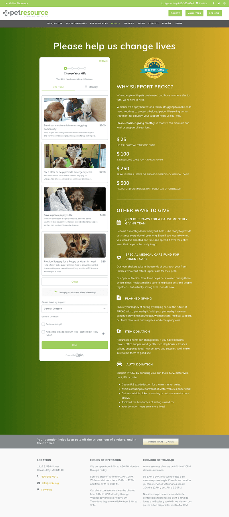
Pet Resource Center of Kansas City created a donation page that tells supporters how their donation will make an impact. They included a way for donors to direct their support (such as a general donation or special care), an option to dedicate a gift, and a way to offset processing costs.
Like what you see?
Request DemoDONATION FORM
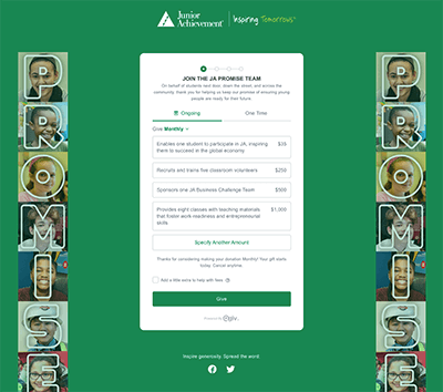
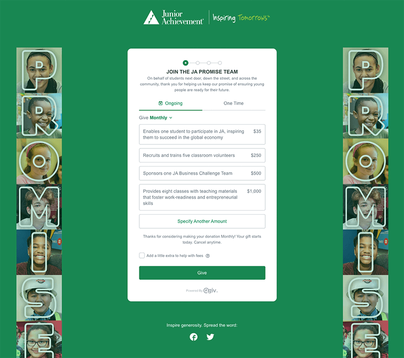
Junior Achievement of Wisconsin created multiple giving options corresponding to the pillars and values associated with their mission of inspiring and preparing young people to succeed in a global economy. They also included GiftAssist, a feature that offers a way for supporters to offset processing costs by adding a small amount to their final donation.
Like what you see?
Request DemoDONATION FORM
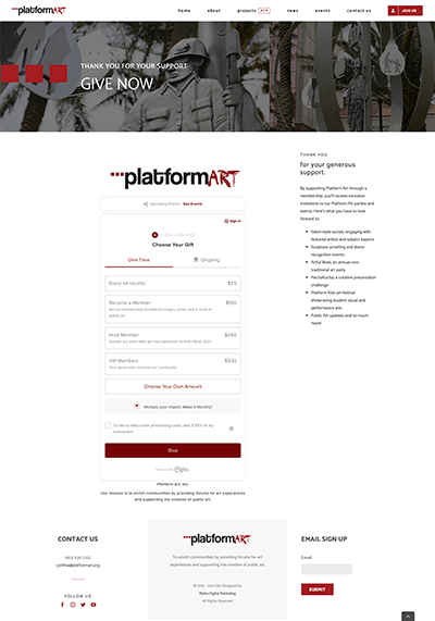
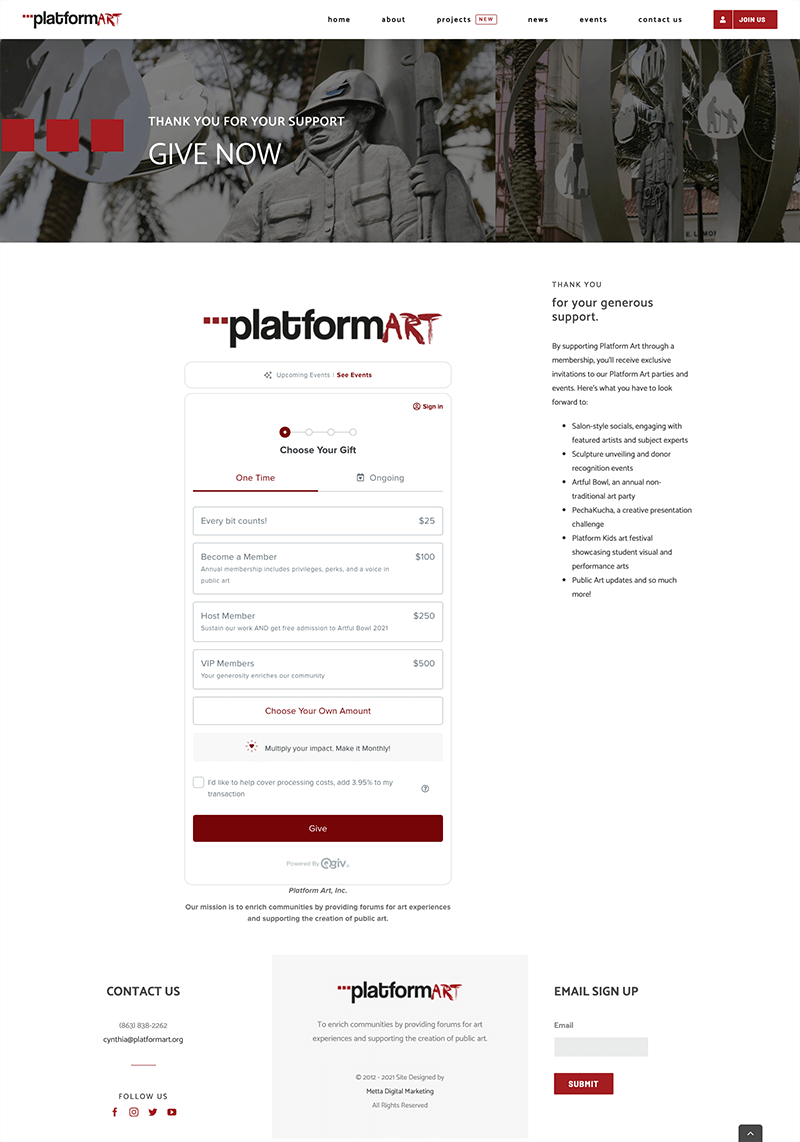
Platform Art embedded a branded donation form on their own donation page. They created custom memberships that include details about the cost and perks of each membership level. They also included a link to their upcoming events at the top of the donation form, as well as details about each event to the right of the form.
Like what you see?
Request DemoDONATION FORM
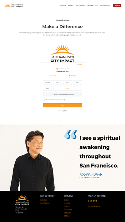
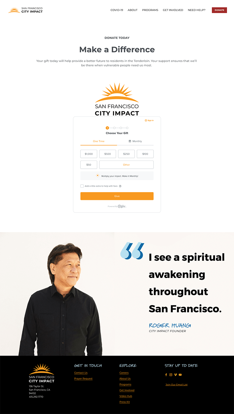
San Francisco City Impact embedded a branded donation form on their own donation page. They included impact information, a way for supporters to sign up for news emails, and links to their social media accounts.
Like what you see?
Request DemoDONATION FORM
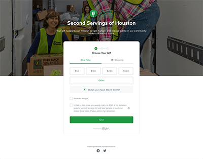
Second Servings of Houston created a multistep form with impact information and live photography of staff. They included a way for supporters to offset processing costs (called GiftAssist) and a way for supporters to dedicate their gift.
Like what you see?
Request DemoDONATION FORM
The Roundhouse Aquarium donation page and form includes several impact statements and pictures tied to donation amounts to maximize their appeal. They include a short introduction about why support matters, along with an impact statement on the donation form itself that focuses on the supporter.
Like what you see?
Request DemoDONATION FORM
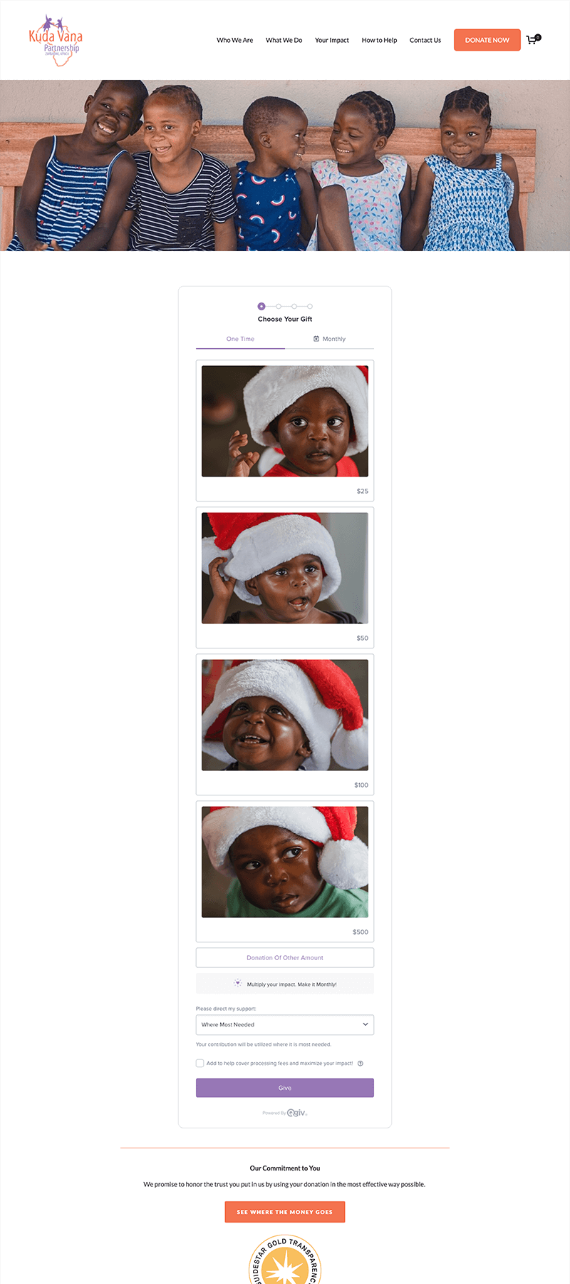
Kuda Vana’s donation form is a great example of how to show impact information tied to specific donation amounts using images and text. Overall, their donation page is focused on who the gift impacts and explains why setting up a monthly recurring gift has an even greater impact.
Like what you see?
Request DemoEVENT
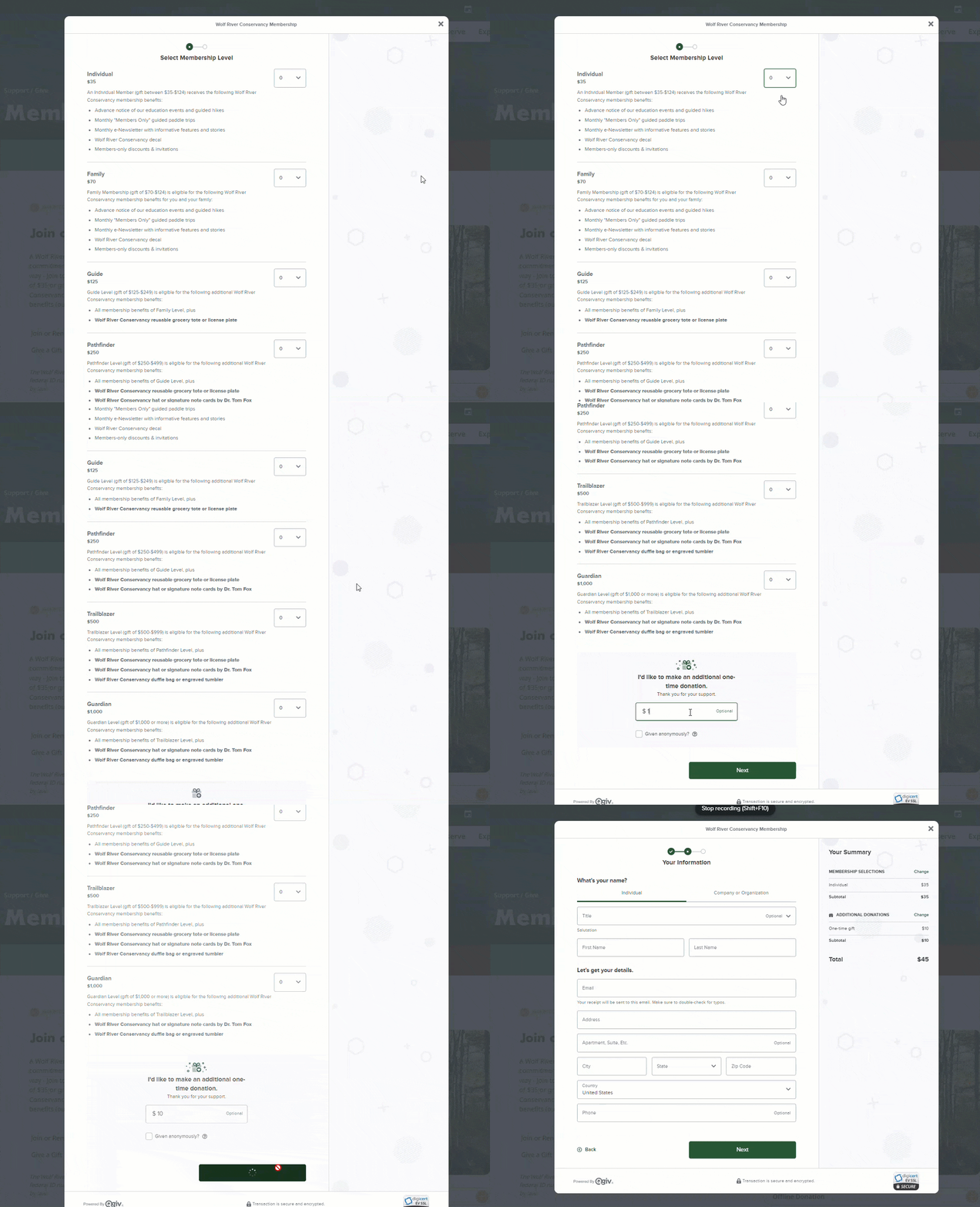
Wolf River Conservancy embedded their Qgiv event form right on their website to easily sell memberships! This is a great way to support year-round fundraising efforts, while keeping supporters on your page. We love that they took it a step further by adding a clear call to action for folks to give an optional one-time donation in addition to their membership fee!
Like what you see?
Request DemoEVENT
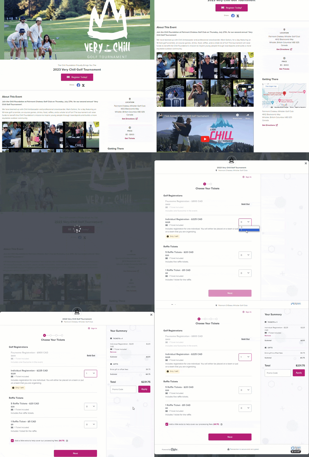
Chill Foundation created a fully branded event landing page for their second annual Very Chill Golf Tournament using Qgiv’s event tools—complete with a registration form that supporters adore for its user-friendly design and easy-to-find links for social sharing! We love the customization they added with Qgiv’s video and map widgets—this makes it easy for registrants to know what to expect on the big day. On their registration form, they utilized Qgiv’s package tool to sell various registration options, drive raffle ticket sales, and communicate Sold Out messages.
Like what you see?
Request DemoEVENT
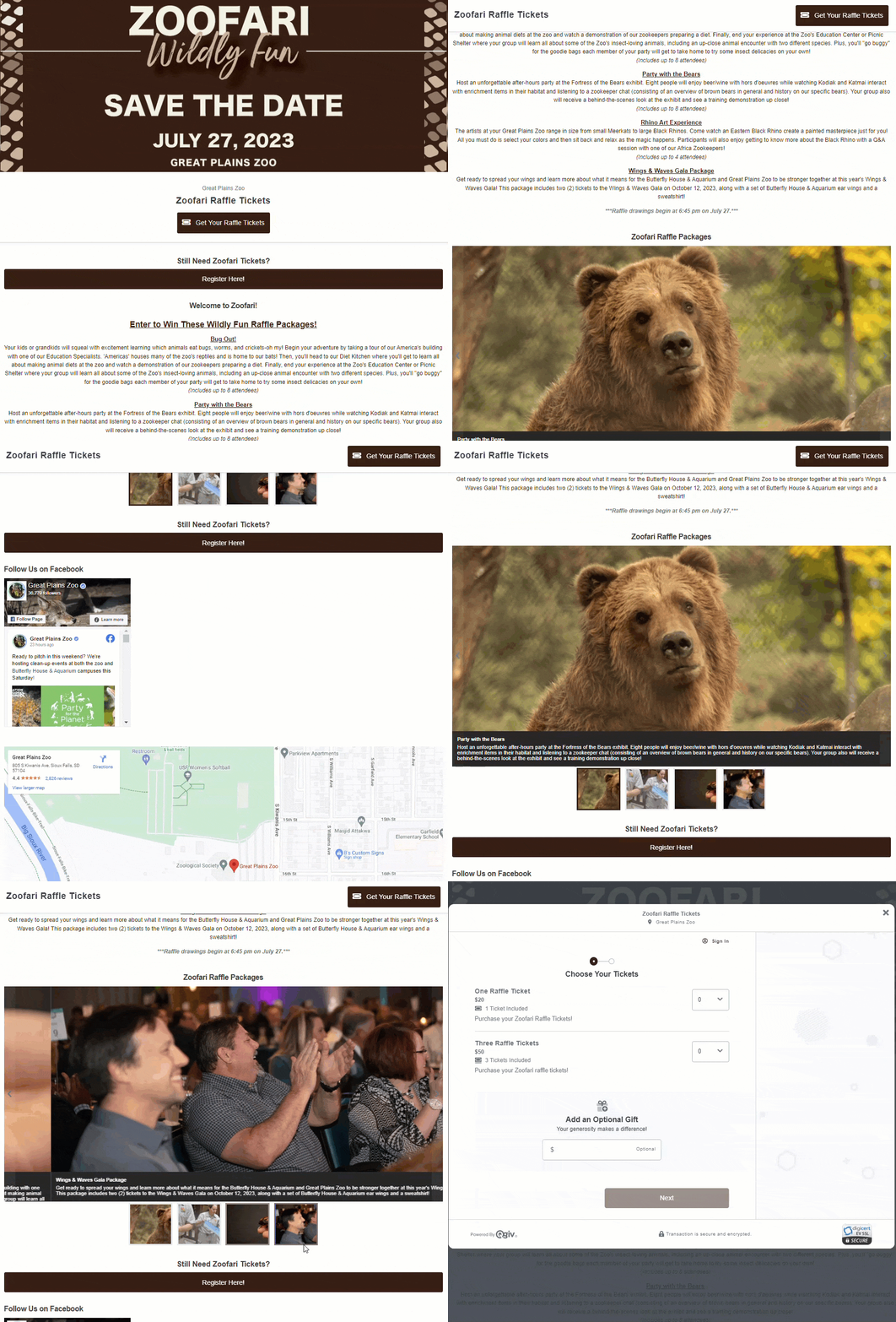
Great Plains Zoo got creative with Qgiv’s event landing page—they used it to sell raffle tickets online and cross-linked to their Qgiv auction to drive more ticket sales. We love the branding and raffle prize details, including the image gallery.! They used customizable form widgets so supporters can see their Facebook feed, and they took it a step further by including a Google map to help folks find the zoo!
Like what you see?
Request DemoPEER-TO-PEER
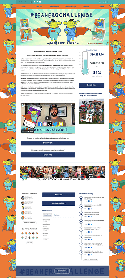
Holton's Heroes knocked it out of the park with their peer-to-peer event design for the #BeAHeroChallenge. They reimagined their summer event in the form of a virtual photo challenge by asking supporters to "pose like a hero" to honor and celebrate brain injury survivors everywhere. They included a short video explaining the challenge, made it clear how people can participate, and even offered fundraising tips for their supporters!
Like what you see?
Request DemoPEER-TO-PEER
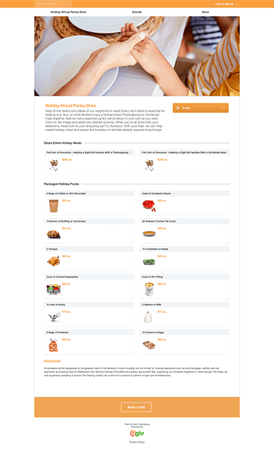
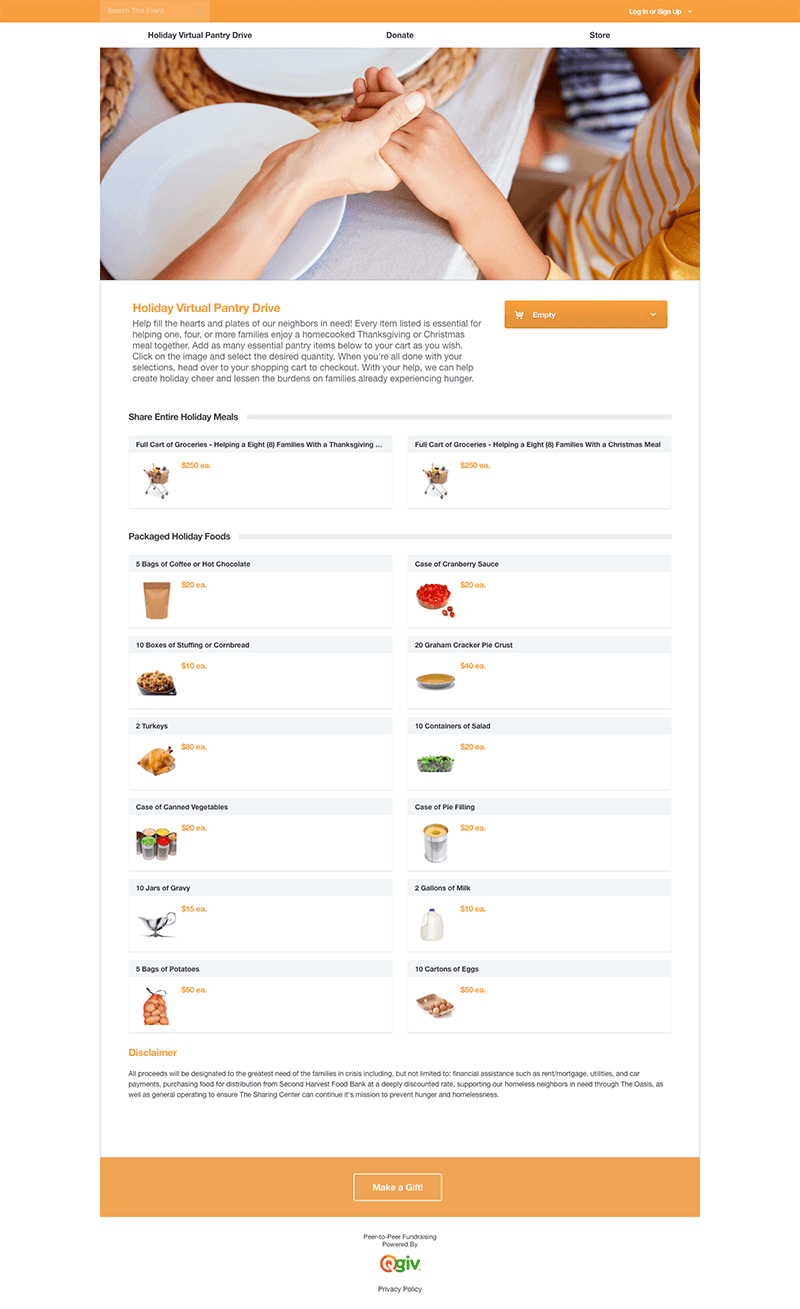
In response to the increased need for assistance related to the COVID-19 crisis, the Sharing Center set up a virtual pantry using the online store feature on Qgiv's peer-to-peer platform. They wanted people to feel like they were donating food by experiencing a mock grocery store. The funds raised through the Virtual Pantry are then used to purchase food for local families in need. Within the online store, they set up categories for different types of items, such as household and dry goods.
Like what you see?
Request DemoPEER-TO-PEER
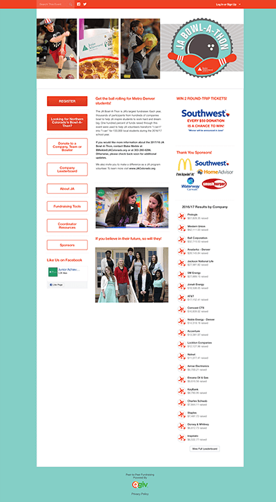
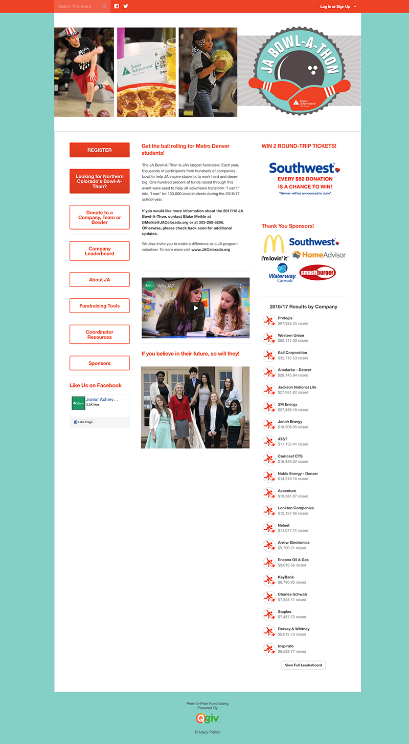
Junior Achievement Rocky Mountain created an eye-catching peer-to-peer page for their Bowl-a-Thon event. They made it easy for donors and participants alike to find the information they need by adding buttons for various roles like team captains and coordinators. They included information about JA's mission and impact, explained how the bowl-a-thon works, and even invited visitors to the page to volunteer. They included a photo gallery showing teams in action, and below that they added leaderboards for companies, teams, individuals, and donors—what a great way to foster friendly competition in the name of a good cause!
Like what you see?
Request DemoFUNDHUB LIVE
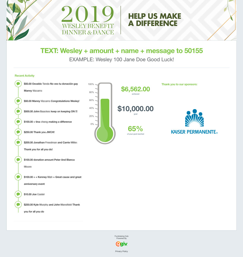
John Wesley Community Health Foundation set up a nicely-branded FundHub Live and displayed it during their 2019 Benefit Dinner and Dance. Attendees sent a text message to the organization's simple text-to-donate number, included a donation amount and a simple message for the organization, and watched as their messages showed up on the big screen in real time as the donations rolled in!
Like what you see?
Request Demo
Thank you to our clients and industry experts for recognizing our fundraising platform! We're blushing.
See our full list of accolades >
