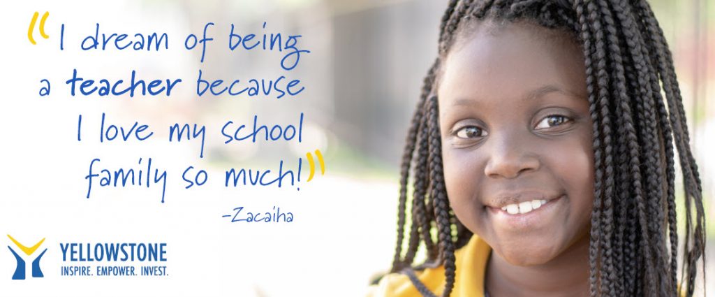
Yellowstone Academy is a nonprofit, nondenominational, Christian private school in Houston’s Third Ward. The students come from all walks of life – many academically disadvantaged. School administrators understand the impact of poverty on education and future successes. Therefore, they work tirelessly to ensure every student has every resource needed to reach their full potential.
The school takes a holistic care approach to education. Because of this, students have access to social services, meals, transportation, and more. The curriculum is academically rigorous, and students are held to high standards. However, the difficulty doesn’t keep students from loving their school. Instead, they’re doing their best to grow into productive, happy adults. The school relies heavily on donor support to give every student opportunities for success. They accomplish this using powerful images and videos to show the impact of donations right on their peer-to-peer campaign pages!
Use images that show donors’ impact
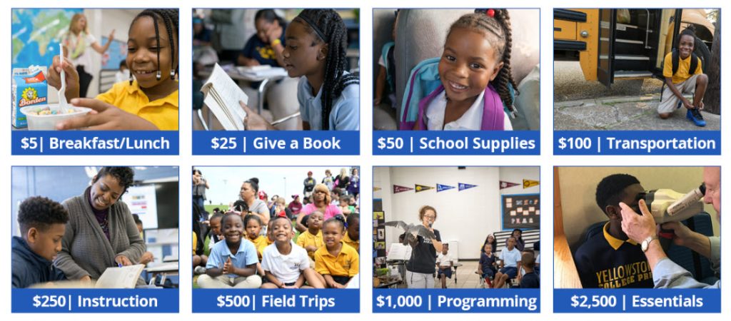
When asking for donations for specific amounts on their peer-to-peer campaign page, Yellowstone Academy shows what is accomplished at multiple giving levels. They use images of actual students benefiting from the services donors are paying for.
Other nonprofits can use this winning tactic. Determine what services cost and align those costs with a specific giving amount. Then, pair that donation amount with an image of someone benefiting from the service.
Incorporate video
Video testimonials from beneficiaries show donors who benefits. Yellowstone Academy is careful not to overload their campaign page with videos and images. They strategically include two videos discussing the impact of donations on those they serve.
The first video highlights their kids and shows how the school is helping them succeed. It’s higher up on the page because it acts as a video testimonial more than an explanation of services. The second video appears below the impact buttons to explain the mission of the school and explain why their services are crucial to children in Houston.
Show relative statistics visually
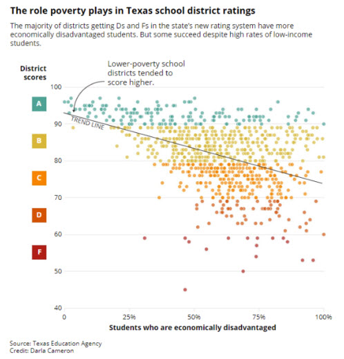
The second video is supported by statistics about the impact of being an economically disadvantaged student and how those trends can be reversed with access to high-quality education. Because of this, Yellowstone Academy uses more than an emotional appeal. Instead, they’ve built a strong case for support marrying emotion with facts and figures.
Reinforce trustworthiness with social proof
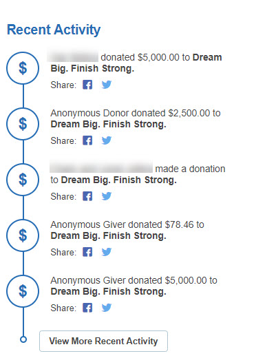
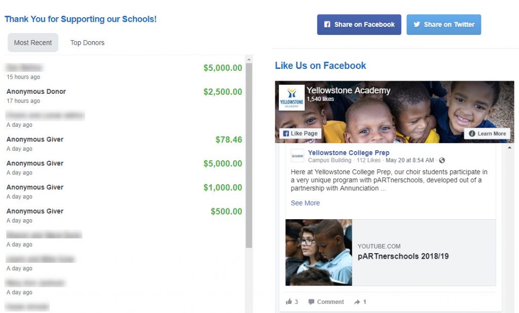
Yellowstone Academy incorporates data, emotional appeals, and widgets strategically on the page. Because of this, they reach donors motivated by several different factors. The page also isn’t static. It’s constantly updated using widgets. Therefore, Yellowstone Academy constantly provides social proof by displaying recent activity and listing their top supporters. They’re also using the Facebook widget to reinforce the impact of donations by showing what they’re making possible with those funds.
*Donor names blurred for privacy.
Conclusion
Show donors exactly what they’re supporting using impact images, video, and social proof. Images of who you serve and showing your supporters helps build your credibility. Ask yourself, do you show donors what their gifts do? If not, using these strategies can help.
Not sure how to start using your own images? This article will help.
