Fall is finally here, and that means another fall event season for nonprofits. Qgiv’s peer-to-peer platform makes it easy for event coordinators to create beautiful, streamlined peer-to-peer event registration pages for all their fundraising events. While Qgiv’s peer-to-peer registration page settings do the job well as-is, there’s a ton of customization options to make your event match your branding and catch your supporters’ attention. This customizability means most of the form, from text to images, can change to meet each event’s needs.
These tips from Afton Lorenz and Bailey Ferguson, Qgiv’s Customer Success Managers, present some best practices for designing your Qgiv peer-to-peer registration pages. Their tips will help your organization attract more registrants, see more completed individual fundraising pages, and raise more money.
- K.I.S.S. – Keep it short and simple
- Ask the right people the right questions
- Your registration process can do more than accept registrations
- Promote your event and send your link to supporters
- Redirect your old event form
- The best way to register guests the day of
- Integrate an online store option into the registration process
- Modify the look and language to match your audience/event
- Integrate creating a fundraising profile page into the registration process
- Ask for registration page advice
K.I.S.S. – Keep it short and simple
Your registration process shouldn’t be a chore for attendees to complete. A long process with a lot of custom questions can hinder guests from completing their registration. Many may even give up and decide it’s not worth it.
“Don’t overdo it with custom fields and a lot of choices,” Afton said. “If your registration page looks intimidating, many people won’t even attempt to complete it.”
Instead, use these tips from the CSMs to keep your forms short and simple:
- Keep custom field questions to a minimum
- Help avoid confusion by limiting the number of unique classifications and categories to a manageable amount (you don’t want to overwhelm your supporters with options)
- Turn off the option to have non-fundraising participants if you can (there are exceptions to this rule. For example, children participating in your event)
By eliminating the choice to be a non-fundraiser, you’re working to streamline the registration process for your donors.
Be aware, though, that eliminating the non-fundraising option doesn’t force participants to fundraise! But have no fear. We have lots of ideas for keeping them engaged along the way.
Ask the right people the right questions
If you’re taking advantage of custom field questions during the event registration process, bear in mind that the questions may not need to be asked of every participant.
“Whenever you’re asking those custom questions, you have the opportunity within our platform to only ask questions for specific categories of people or for specific interactions participants are having such as questions just for donors or registrants,” Afton said.
For example, if you’ve set up a category for your existing volunteers to choose time slots, you don’t want them to see a custom question that asks if they’re interested in volunteering for your organization. You can choose settings that will only display that question to relevant parties.
Your registration process can do more than accept registrations
First, don’t disable optional donations on your registration form. There’s really no good reason to disable the ability for your supporters to give you more money when signing up for your fundraising event.
“Always allow optional donations. I always tell people, ‘People want to give you money. Let them,’” Afton said.
Your supporters want to support you and be invested in your mission. Another way to make your registration page work for you is to use it to collect mobile numbers for text fundraising and event communication. When you’re hosting a physical event, ask for phone numbers to build your contact lists. Customize the language when asking for the phone number to give registrants a chance to opt in to receiving communications from you. That way, if your nonprofit uses tools, you’ve already started the process of collecting mobile numbers for text fundraising campaigns.
“We’ve found people are more likely to want to give their phone number if you’re doing a physical event because they know that’s something everybody’s going to ask for,” Afton said.
“We’ve had people set up custom fields so their registrants and donors can agree to communication from the organization,” Bailey said. “Then they use outbound text messaging for live events so they can keep them updated during the event.”
Pro tip: Change the wording from “phone number” to “mobile number” so you’re specifically asking for a cell phone number. Don’t forget to include a custom field asking donors if they want to opt in to communications from you. This is as simple as adding a checkbox with language like, “I’d like you to contact me via text.”
Promote your event and send your link to supporters
How do you drive supporters to your peer-to-peer event page to register? You have to reach out and share the link. Don’t rely on visitors seeing the link on your website. Instead, be sure to send it to supporters across multiple marketing channels.
“Send a link via text message. You can use Qgiv’s outbound text messaging for that, but you need a phone number database first,” Bailey said. That’s why asking supporters to opt in to text communication during registration is so important. You can easily text attendees of all your past events so long as they opted in to receive text messages from you.
An underutilized tool in your arsenal is Qgiv’s peer-to-peer email campaign feature. This tool makes sending an email to last year’s event attendees quick and easy. The best part, you know they’re already interested in your event because they’ve attended before.
“For events organizations have year after year, log in to the previous year’s event and email all the past registrants letting them know about the upcoming event, including the new URL, through a Qgiv email campaign,” Afton said.
“Then keep using email campaigns to keep them engaged throughout the span of the event so they can reach out to more of their network to keep donors and registrants involved,” Bailey added.
Redirect your old event form
This next step is important. You don’t want to confuse registrants by allowing them access to your previous years’ event pages. Instead, automatically redirect visitors to old event pages to your new event by creating a redirect within Qgiv.
“If people know it’s the time of year you host that event and they go to the site they’ve gone to in the past, they will automatically be taken to the right form,” Afton said.
The best way to register guests the day of
“Day-of guest registration is best handled via Mobile Virtual Terminal,” Bailey said. “You can use Wi-Fi or a hotspot to register guests quickly.”
“You can use Mobile Virtual Terminal and card readers for on-site donations, too” Afton added.
Integrate an online store option into the registration process
Want to make more money by selling event merchandise or things taking up space in a supply closet? Set up an online store and make purchasing items an option in your registration flow.
“It’s super easy to set up and if you have a whole closet of old t-shirts or something, you can sell them easily this way,” Bailey said. “Include the store products in registration. Even if donors don’t make an optional donation, they may consider buying a t-shirt or hat. It’s sort of like an incentivized optional donation.”
“This is one of the biggest things I suggest to people,” Afton added. “It’s a great way to do easy raffles. If you have one item you want to give away at your event as a prize, you can sell raffle tickets through the store.”
Your registration store can do more than help you sell products. Create sponsorships and “sell” them at registration. A business owner looking to show their support can quickly sponsor your event while on your registration page. In the item details, spell out the sponsorship benefits for each package level.
Modify the look and language to match your audience/event
A great registration page doesn’t just make it easy for registrants to sign up. The registration page’s aesthetic should hold the attention of your intended audience and further inspire them to take part in, and even share, your fundraising event. This is where Qgiv’s customizability helps nonprofits. With Qgiv’s Event Builder it’s easy to customize your event – even with no technical skills.
“Change the form verbiage to match the style or the audience of your event,” Afton said.
“A lot of people don’t know that you can customize a lot of the registration process,” Bailey added. “Using widgets, unique images, and changing the verbiage allows you to customize it quite a bit. Just be careful not to do too much and confuse people.”
Integrate creating a fundraising profile page into the registration process
You can lead a registrant to their personal fundraising page, but you can’t make them fill it out. This post-registration action often doesn’t get completed by every fundraising participant at a peer-to-peer event if it’s treated like an optional step. Instead, use the following tip from Afton to see a greater number of fundraising page completions.
“On the registration detail page, I always delete the top section of the form. This keeps attendees from thinking they’re done and can navigate away from the page.” Then, depending on whether the event allows for non-fundraising participants or not, I move sections of the page and reword them to keep fundraising participants moving from the registration process to the profile creation process,” Afton said.
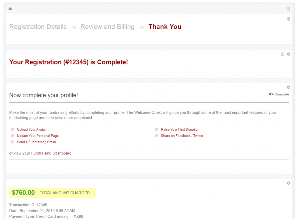
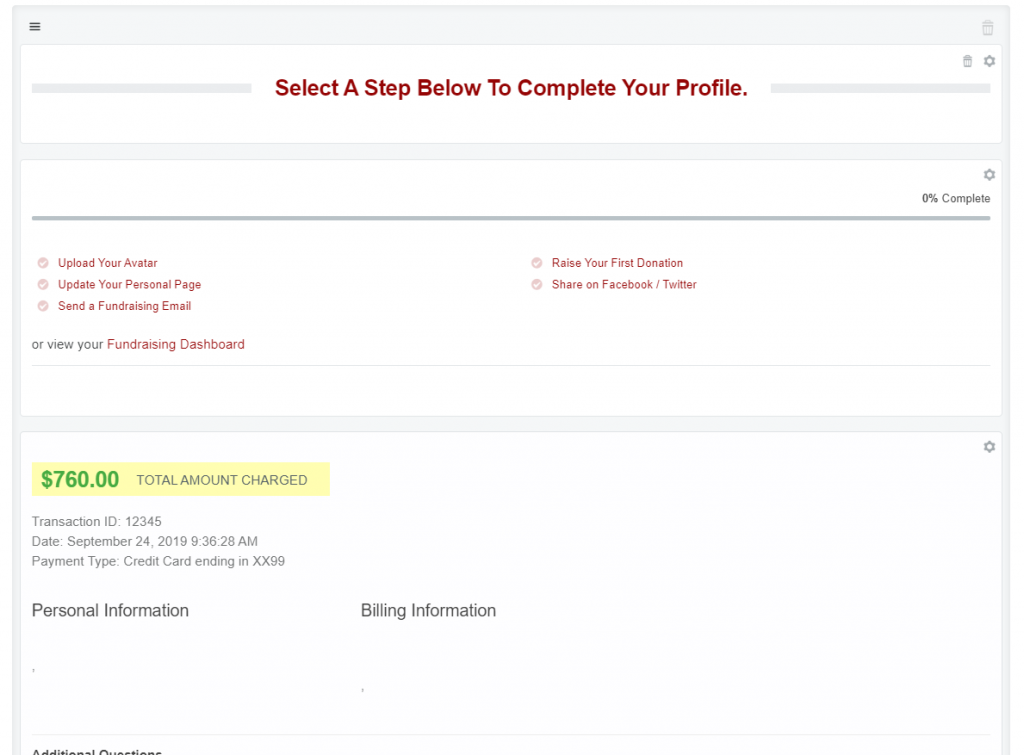
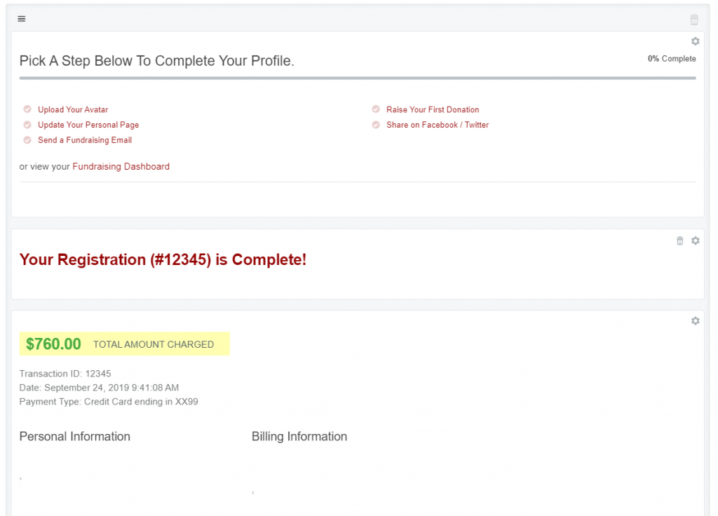
The images below show how to modify the Registration Details page to get fundraising participants to complete their profiles.
The first is an unmodified Registration Details Page

This version is for events with non-fundraising participants disabled

This image is how the CSMs suggest customizing this page for events that don’t have non-fundraising participants.
This format takes advantage of a customizable header. Afton’s changed the verbiage of the existing page header to provide clear instruction to fundraisers that they must click an option below to begin their fundraising profiles.
The header is displayed to all registrants because non-fundraising participants were disabled in this event.
This final version is for events with non-fundraising participants

The final image shows how to modify the page in a way that makes sense for non-fundraising participants while still prompting fundraisers to give.
This format works because the top section of the image isn’t displayed to non-fundraisers. They’ll see everything below the prompt to complete their fundraising profile when the page loads.
Fundraisers, on the other hand, will see instructions for completing their profiles at the very top of this page.
There are subtle language changes between the second and third image depending on the types of attendees who will see this page.
This method makes creating a personal fundraising page a part of the registration process. Organizations have found their fundraisers were more likely to complete their pages by making it appear like a continuation of registration. The best part is, even though the registration detail and thank-you steps aren’t visible along the top of the page, donors aren’t missing out on a thank-you message.
“They still have all their confirmation information and they’re still going to get an email, but you’re hoping they’ll continue that process instead of leave and maybe come back later,” Afton added.
Ask for registration page advice
Each nonprofit using Qgiv for their peer-to-peer fundraising tools will have unique uses for these forms. A one-size-fits-all approach doesn’t work to set your event apart from others. So, both Afton and Bailey encourage organizations using Qgiv to contact them to discuss their specific needs with them. This way, they can offer advice to make your registration forms work best for you.
“If you have questions about your specific use case, our team loves walking you through things, asking questions, and making sure you’re covering all those pieces,” Afton said. “We’ll make sure you know exactly what you have to have and not add anything that will bog you or your fundraisers down.”
Final thoughts
Your peer-to-peer event registration process can make or break your fundraising event. Attendees won’t complete an unfriendly form. Using the tips outlined in each section above will help you attract the right guests to your event registration page and see them through to completion of their fundraising profiles. Above all else, remember to focus on keeping the form short and simple. Then focus on branding your registration pages and adding those special touches (like an online store accessible at registration) to add opportunities to delight your donors and raise more funds for your mission.
You want to host successful fundraisers and meet your fundraising goals. We’re here to help! Email our support team for personalized advice on your next peer-to-peer event. Looking for more info on our peer-to-peer tools? Visit our peer-to-peer page to learn more.


