Online giving to charitable organizations (colleges included!) has increased an average of 10% every year since 2012. In 2020, it grew by 21%. And—according to a report by Nonprofit Source–54% of donors worldwide prefer to donate online with a credit or debit card.
Now, I’m not here to say direct mail is dead (it most certainly isn’t) but I do believe that if your college or university isn’t making online giving a priority, you’re missing out on a massive opportunity to raise more for your institution.
So what are the tell-tale signs that online giving isn’t a big enough priority for your institution? And what changes can you advocate for to increase online donations? I’ve worked in higher education and have heard firsthand some of the questions donors have when trying to navigate a tough donation process. Here are some of the questions I’ve heard and tips on changes you can implement to make online giving easy.
Problem: “I’m on the website but where do I make a donation?”
This question makes every fundraiser’s heart sink a little. Why? Because someone has put the effort into reaching out to you by phone or email to ask how to give. Ideally, giving should be easy and something any visitor to your website can figure out. It begs the terrible question, “If this person has reached out to ask me how to donate on our website, how many others have tried and not reached out and just given up?”
Solution: Make your donation form easily accessible from your home page.
All visitors to your website’s homepage should be able to easily access your giving form. Having a “Donate” button on your homepage creates a direct path for your donors, and anyone interested in giving, to support your university. The more steps there are in the donation process, the less likely someone is to make a gift.
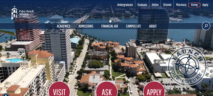
This process starts on your homepage. Adding a “donate” button to your homepage cuts down on the steps your website visitors take to give, increasing the number of donations you receive online. Palm Beach Atlantic University is a great example to follow—they have a button on their homepage that directly links to their giving form!

Problem: “I tried making my donation online but was confused…I figured it’d be easier if I just called you to donate.”
Ouch. If someone is confused enough by your online donation process that they decide to look up your college’s number and call you, you’ve got a problem. The donor that calls for help to donate is making a very clear statement about your donation form: it’s not worth the trouble of filling out. If someone is less determined to give they won’t call to complete their donation, they’ll give up.
Solution: Keep your donation form simple! And mobile friendly.
Amazon’s one-click buying feature is based on the same online conversion data. The less steps a website visitor takes to complete a transaction or process, the more likely they are to complete that transaction or process. Donors are used to simple checkout processes like Amazon’s, so if they have to click through numerous pages to donate they’ll likely be confused. Keep the pages, and length, of your donation form to a minimum to curb donor drop off.
Adding branding to your donation form that matches the branding of your college will create visual consistency for your donors and assure them that they haven’t accidentally navigated to another site. This can be as simple as adding a color to your donation amount buttons or a banner image to your form! Branding not only creates visual consistency for your donors, it can help your college raise more online too. After all, donations made through a branded form tend to average 38% larger than those made through a generic form.
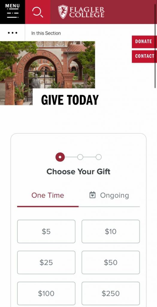
Whatever changes you make to your donation form, make sure they are mobile friendly. Approximately 26% of all online giving is processed on mobile devices, and 51% of nonprofit website visitors visit from a mobile device. Nothing is more confusing than a donation form not formatted for mobile. Flagler College’s giving form below is an example of a mobile friendly, beautifully-branded giving form. Their giving form is easy to navigate and features the university’s signature red branding throughout the form.
Problem: “I’m not sure if I made a donation or not…can you check for me?”
When a brilliant professor with their PhD in microbiology calls and asks this, there’s more at play than simple “user error.” This question indicates a problem with your giving form—it’s not clear. It could be a loading issue with your form or the donor’s browser, but if this question’s repeatedly asked it’s more than a fluke.
Solution: A clear confirmation process and page.
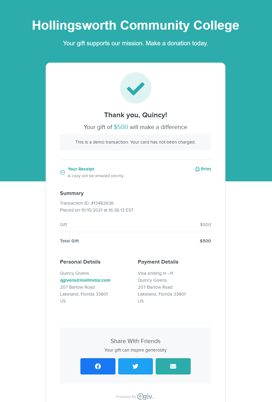
When a donor has filled out all their information in your donation form, is the next step clear? The final step a donor must take to submit their donation should be obvious. Make sure your donation form has a clearly-labeled button near the last field a donor will fill out that indicates the end of the donation process. Once this button is clicked your donor should land on a confirmation page. Below is an example of a standard Qgiv confirmation page.
Conclusion
Your donation form can make giving to your college easy or difficult. Don’t let your donation form curb online gifts to your institution! By adding a donate button to your homepage, reducing the number of pages in your donation process, branding your form, and adding a clear confirmation process, your college will be ready to conquer online giving.
For more donation form best practice tips, check out these blogs:


