At some point in your professional fundraising career, you’ve probably heard the importance of storytelling when crafting your nonprofit’s donor experience. In fact, you’ve most likely heard every industry leader teach this until they’re blue in the face! No matter your experience, a crucial aspect of storytelling is helping donors understand what your organization does and showing how, or who, you’re helping.
The donor experience doesn’t stop with social media and email appeals. It’s crucial that your online donation forms and landing page match the story you’re telling. How? Add impactful images or videos and text to your donation form and landing page!

What is an impact statement? How can I show visual impact?
An impact statement is your organization’s story about your influence on the community. It’s an important part of the storytelling journey and is how your organization communicates what’s happening. Whether your organization offers services or tangible goods, it’s important to connect donors to your cause. What connects donors to your cause? Showing the impact of your organization by providing real life examples of your services and telling your story throughout the donor experience.
There are several ways to show impact including:
- Adding a banner image to your landing page
- A background image on your landing page
- Adding images directly to your donation form
- Images tied to donation amounts on your donation form
- Images tied to giving plans
1. Adding a banner image to your landing page
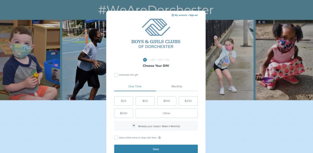
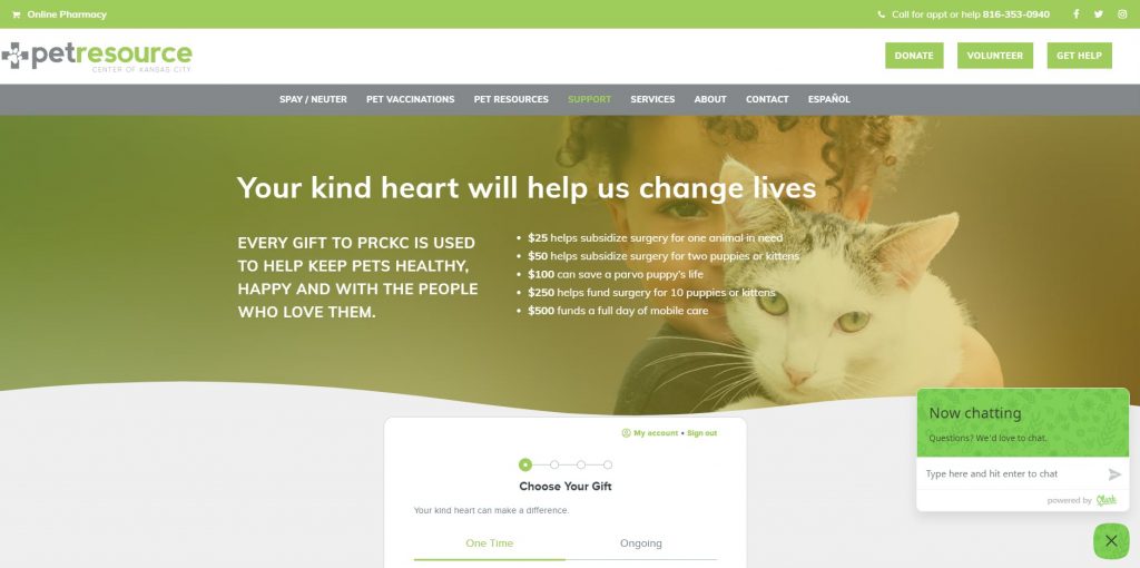
A banner image is the introduction to your landing page, it’s the very first thing donors see after the page loads. Banner images are a great way to set the tone of a page and one area your organization can use to relay important information to donors. If your organization is running a specific appeal, then the banner image and messaging should match or closely resemble your campaign theme. For more generalized appeals, make sure to use the banner section to reiterate your nonprofits’ story. Let’s look at some examples:
Boys and Girls Club of Dorchester
Boys and Girls Club of Dorchester added a banner image with cute pictures of children.
Pet Resource Center of Kansas City
Pet Resource Center of Kansas City added a banner with an image and text to highlight how each donation amount makes an impact.
2. Add a background image
A background image is a subtle way to reinforce your storytelling efforts! Since your donation form will be the centerpiece of your landing page, the focus of your background image will need to be to the left side or right side of your form. Use this space!
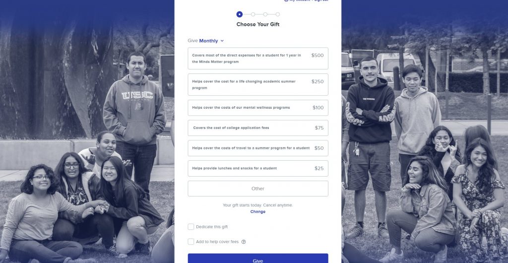
Again, you’ll want the focus of the image to be the people benefiting from your organization’s services. Since background images need to be large, the experience will be more immersive for donors! That said, don’t draw too much attention from your donation form. A background image that has too much going on will only distract donors from the goal: donating. Let’s look at some examples:
Minds Matter of Los Angeles
Minds Matter of Los Angeles added a background image of the students that benefit from their programs.
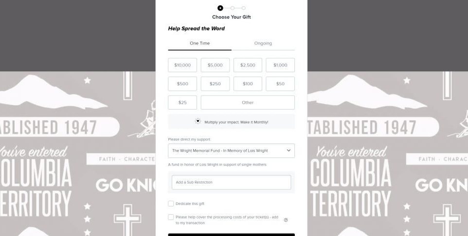
Columbia Christian School
Columbia Christian School added a background image for branding purposes and reiterating their motto.
3. Adding images directly to your donation form
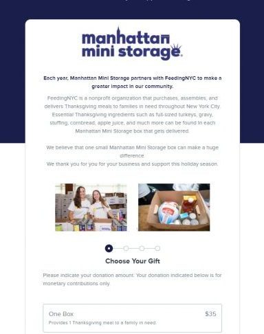
Adding images directly to your donation form is another great way to show visual impact! Since the images live at the top of your donation form, donors must scroll through before getting to the rest of your donation form. Let’s look at some examples:
FeedingNYC
FeedingNYC added text and images to their donation form to explain how a donation impacts their organization.
4. Adding images tied to donation amounts on your form
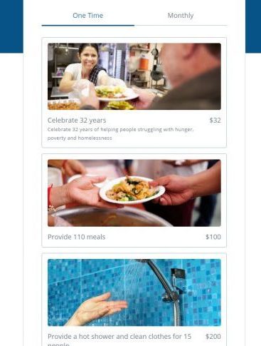
How do you help donors understand the impact they make with their donation? By adding images to your donation amounts with brief description text! The image should show who the donation impacts while the description explains how the donation makes a difference. For example, if $25 buys a meal for 1 child for a week, your image should have a child holding lunch and a description like, “For $25, your donation will provide lunch for 1 child for a week.” Let’s look at some examples:
The Soul Box Project
The Soul Box Project added images and a brief description so donors know how their donation will make an impact.
Paz De Cristo Community
Paz de Cristo Community added images to their donation amount to show visual impact of each donation.
5. Adding images to giving plans
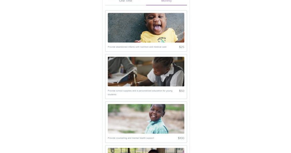
Giving plans offer donors the option to donate on a recurring basis to support your cause. If your online donation form has the option, your organization can create giving plans and add images to these plans on your form!
As with one-time gifts, the image should relate to the giving plan and a brief description of what the recurring gift provides. For example, an animal clinic that offers surgeries to injured animals may write a description like, “Your donation of $25 a week covers the cost of surgery for injured animals.” The associated image should be of a happy, recovering animal. Let’s look at some examples:
Minnesota Ovarian Cancer Alliance
Minnesota Ovarian Cancer Alliance added images to their giving plans to show visual impact of a recurring gift.
Kuda Vana
Kuda Vana added images of the kids that each recurring donation will benefit.
[Bonus] To add video or not?
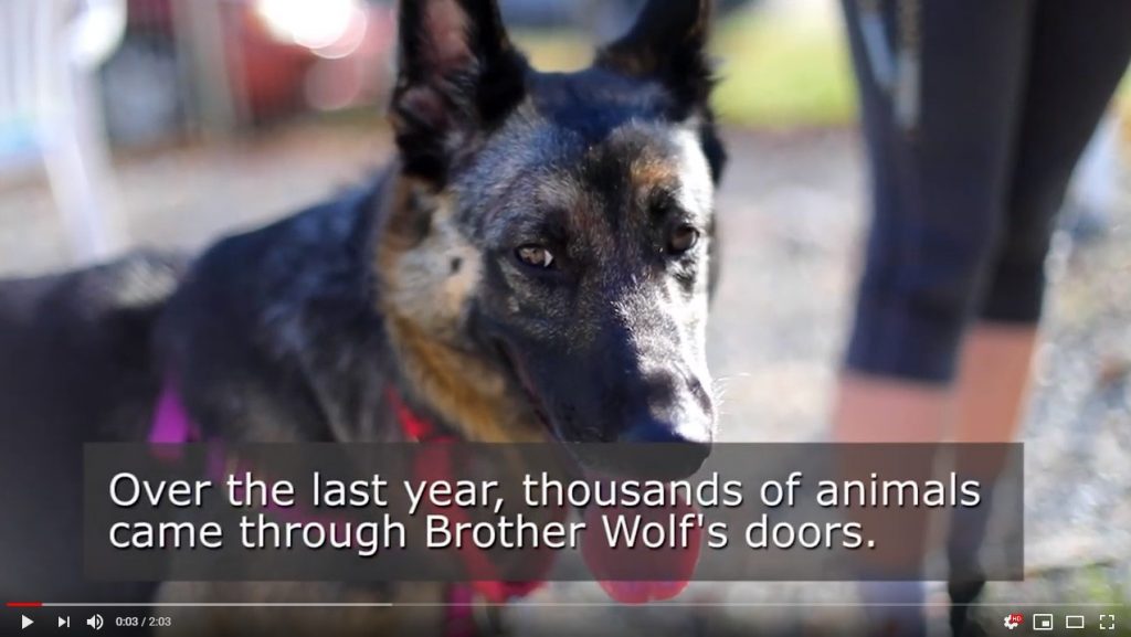
Video stories have the power to communicate your mission to donors in an engaging, immersive experience. Rather than an image or text, videos are more interactive and are better at conveying your mission and gaining a donor’s trust. Studies have shown that adding videos to your landing page can increase conversion rates by 80%!
Wow! That sounds amazing. Why would anyone not want to add video?
Well, there are two big reasons. One is the distraction factor! Donors getting sucked into watching an outstanding video sounds like a great idea until you realize they’re actually being distracted from the donation process! Our friends over at NextAfter found that adding a video to your donation form can reduce conversion rates by up to 560%!
Videos can slow down the load speed of your landing page. If your landing page loads too slow, donors can’t donate. It won’t matter how good your storytelling is if a slow landing page frustrates donors. You really want to optimize your donation form to load quickly; studies show that 0-4 seconds is the optimal load time. Each additional second of load time decreases your conversation rate.
But that doesn’t mean you shouldn’t use your video at all! Instead of dropping your video on your donation form, try embedding it on your donation confirmation page instead. Donors are already feeling great about supporting your nonprofit when they land on your thank-you page—reinforce those positive feelings by adding a video that thanks them for their gift and shows them the impact they’ll make.

Donation form and landing page best practices
Before you start adding all the images to your landing page, let’s look at a few best practices for your landing page and donation form!
1. Don’t overload your page with images
If you use too many images on your landing page, you will slow down your landing page’s load time. It’s best to optimize your images and then check load times. Remember to aim for 0-4 seconds on desktop and mobile devices!
2. Properly size your images
Properly size your images to fit the placeholder on your site. That means if a banner image is supposed to be 1080×680 pixels, your image should be the exact same dimensions. For places that don’t have an exact dimension, try to match the size based on where the image is going. For example, if you’re adding an image to your donation form, the image doesn’t need to be the size of a banner image.
3. Run your images through an image optimizer
You should also run images through an image optimizer to reduce their file size. Kraken.io and tinypng.com are two such websites. Alternatively, you can look up “image optimizer” for a few other sites. Banner images and background images will be larger files so it’s especially important that these images are optimized.
4. Test your landing page load times
There are a wide variety of ways for your organization to test landing page speed. Check out this article on mobile friendly donation pages to learn more!
That’s a wrap!
Important takeaways:
- Storytelling is an important part of the donor experience and images play a crucial role in helping donors connect with your mission.
- There are a variety of ways for your organization to show visual impact on your online donation forms and showing the impact of a donation will increase conversion rates.
- Videos are a powerful way to communicate your mission to donors but if it slows down your landing page, it’s not worth it.

