You’re undoubtedly familiar with donation forms for nonprofits. But they’re only one kind of form nonprofits use on their websites. In addition to raising money online, nonprofits use forms to build email lists, to recruit new volunteers, to onboard clients, and in lots of other applications.
Online forms are great tools for everything from building email lists to onboarding new clients. There are two broad categories of forms—single-step and multistep—and each one has its own pros and cons. But how do you know which kind of form to use?
Let’s take a look!
Looking for some donation form inspiration? You’ll love these interactive donation form templates!
Single-step forms
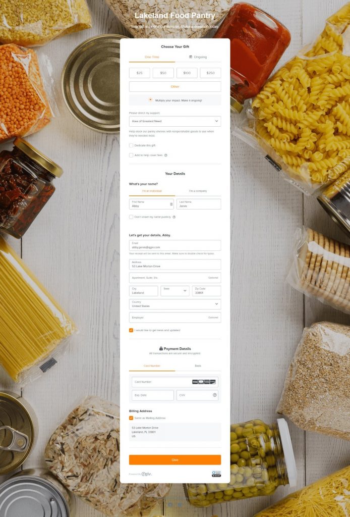
Single-step forms put all form fields in one place. When a user sees your form, every single piece of information you’re asking them to provide is visible!
These forms work best when you’re asking users to do something for you that requires little information. An example is a form on your site that asks people to sign up to receive your newsletter: the call to action (sign up for newsletters) is very clear and straightforward, and the information you need to collect is minimal. You could ask only for an email address or, at most, the user’s email address and their name.
When should I use single-step forms?
Single-step forms work best when they include 1-3 fields. That makes them ideal candidates for forms that ask users to:
- Sign up for newsletters or emails
- Download an asset
- Request information
- Submit requests for contact
These functions generally require very little information from your users. Since you’re asking for high-level information like names and email addresses, these forms contain few fields and are very short.
Should I use a single-step form on my donation page?
Not long ago, having your entire donation process on a single-step form was the accepted best practice for the nonprofit industry. The idea was that more clicks in the donation process meant more opportunities for donors to abandon the giving process.
Today, donor behaviors seem to have shifted. Instead of perceiving single-step forms as a simple way to give without clicking through different steps, donors now seem to be discouraged by the look of long-form donation forms. That’s why you should consider converting your single-step donation form to a multistep format.

Multistep forms
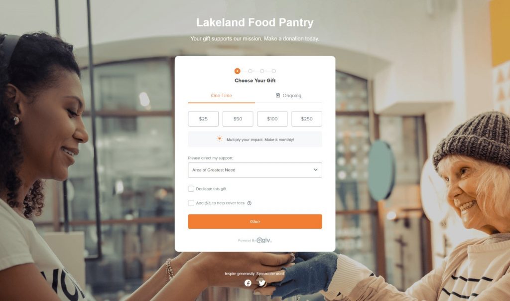
Multistep forms split form fields into “chunks” of information. Instead of having all form fields visible at the same time, different sections of the form are displayed separately. When a user enters their information on one step, they click to move to the next step of the process.
These forms work best when you’re collecting more in-depth information about the people who visit your page. They work well for two different reasons.
One reason multistep forms are especially effective is because they’re perceived as being less complicated than single-step forms. Instead of seeing one long form, people see small, manageable chunks of information. Even if the multistep form is not actually less complex than the single-step form, users feel like it’s less complicated. That’s important!
The second reason is because of something called “cognitive momentum.” Cognitive momentum is the idea that, once we take action, we’re more likely to stay in action. Think about how great it feels to cross an item off your to-do list: the momentum of finishing one task motivates you to tackle the next one! The same concept applies to donation forms. The further someone moves through the process of using a multistep form, the more invested in completing the process they become.
When should I use multistep forms?
If you need your form to contain more than 3 or 4 fields, you should use a multistep form. Forms you may want to use in a multistep format include:
- Donation forms
- Event registration forms
- Volunteer profiles, emergency contacts, etc.
- Surveys
- Client questionnaires
- Any other long-format forms
These processes usually require users to provide more in-depth information by filling out many fields. Splitting them into multiple steps will have a positive impact on your completion rates!
Should I really use multistep forms for my nonprofit donation forms?
Yes! Building multistep donation forms is a great way to improve your fundraising by increasing your forms’ conversion rates. When you display your donation form all in one step, the donor’s decision to give isn’t finalized in their heads until they’ve filled all forms and hit the submission button. There are lots of opportunities for them to leave before finishing their gift! But a multistep process asks them to select their gift up front, then moves them to the next step of the process. In their heads, your donors’ decision to give is finalized: everything else is just a formality!

Nervous about switching? Here are some tips
Change can be scary, especially when it’s change that impacts something as important as your online fundraising success. If you’re nervous about the switch, here are a couple of tips that might help.
First, have a conversation with others at your organization or on your board. Big decisions feel less scary when you’re not the only one making the call! If you have a particularly close relationship with a handful of donors, ask them their opinions, too.
You could also try running an A/B test. A/B testing is a process you can use to definitively determine whether your donors prefer single- or multistep forms! Here’s how to do it.
How to set up an A/B test
First, set up two almost identical donation forms. We’re talking same copy, same imagery, same call to action—everything on your two forms should be identical. The only difference between the two forms is that one should include a single-step form and one should include a multistep form. Since everything else on the donation pages is identical, you’ll be able to confidently attribute any differences in performance to your donation process format.
If you’re using Qgiv, you can do this very easily! Build your form, get the image and copy set up the way you like it, set up your suggested donation amounts, and generally put together your dream form. In your donation form settings, choose either a single- or multistep format. Then, go to the “My Qgiv” section of your control panel, find the form you just built, and clone it. When it’s cloned, go and change the form format. Viola! You’re ready to A/B test your forms.
How to run an A/B test
Once your forms are ready to share, alternate which form you link in your appeals. If you post to Facebook asking for support, include a link to the single-step form. Then, make a similar post with the same call to action later on and link to the multistep form. If you’re sending an email appeal, send an email to half your donors that links to your single-step form. Then, send the same email to the other half of your list with a link to the multistep form.
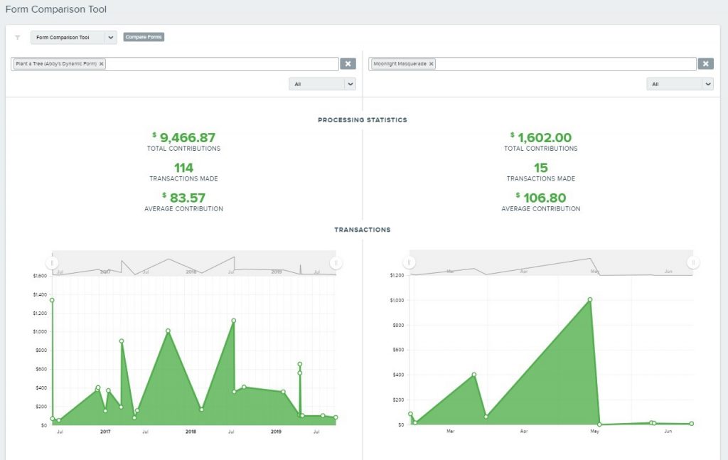
As your donors respond to your appeals, compare your forms’ performance. Which form processed the most? Which form had the highest conversion rate? Did one form inspire larger gifts than the other one? Comparing your forms’ performance will give you the hard data you need to make an informed decision about which format to use! If you’re a Qgiv user, you can use the Form Comparison tool to get a side-by-side comparison of both forms’ performance.

Conclusion
Nonprofits use web forms to collect all kinds of information. Understanding when to use single-step forms and when to use a multistep format is important, especially if you want to get the best possible conversion rates!
If you’re trying to collect high-level information from your users and only need between 1 and 4 fields, use a single-step form. Newsletter opt-ins, “contact us” forms, and other short-form processes get the best conversions if users can complete the process in a single step. If you’re collecting more in-depth information, like the kind of info you’d need to process a donation, use a multistep form. You’ll help users stay focused, prevent them from being overwhelmed, and make it easier for them to complete your form.
Qgiv is here to help!
Want to learn more about Qgiv’s tools? We can show you single-step and multistep forms, our cloning tools, our form comparison tools, and more! Request a demo of our online fundraising tools or give us a call at 888-855-9595 with your questions. We can’t wait to talk to you!


