Who they are
The Windermere Foundation is dedicated to supporting low-income and homeless families in their communities. What started in 1989 as a grassroots foundation, serving families in need in Washington State, has grown to encompass ten states and has raised over $46 million for programs and organizations that provide shelter, food, children’s programs, emergency assistance, scholarships, and other services to the neighbors who need their help most.
What they did
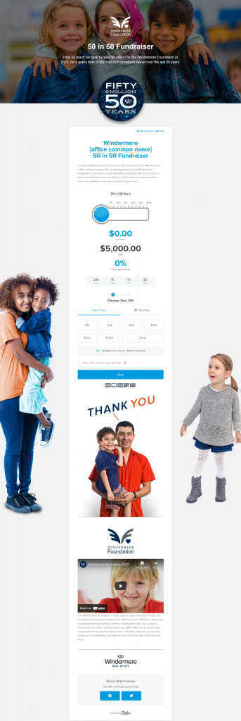
Windermere Foundation used Qgiv’s landing page feature to display a donation form that featured images of the children and families they serve. With careful placement of images, they draw attention to various places on their donation form to encourage donors to complete their gift.
They created this donation form because they realized they had received more than $46 million in donations and wanted to reach $50 million in time for their fifty-year anniversary. This challenge means they’ll be able to provide millions in charitable contributions to other worthy causes benefiting low-income and homeless children and families in the states they serve.
Their donation form was meticulously designed with children making eye contact with the person viewing the donation form, plus an image of one little girl looking at the Make It Monthly prompt on the donation form. Because the eye naturally follows the gaze of the girl, donors are more likely to see this option on the donation form.
What you can do
Your nonprofit can design donation forms meticulously. If you can, you should include images of your beneficiaries to show donors who their donations benefit. This is an especially effective tactic if your nonprofit serves children or animals.
When laying out the images on your Qgiv donation form, you can place them on your landing page like Windermere Foundation did, or you could even incorporate images on your donation amount buttons to act as impact statements.
If you go the Windermere Foundation route, be aware of placement and try to use the direction your subjects are facing for the greatest impact. Make sure some people pictured are staring straight ahead at the person looking at the form. This makes an emotional connection to your cause and those you serve. Where possible, direct the eyes to key parts of the form, such as the recurring gift nudge, to convince people to make their gifts monthly or make a larger impact on your nonprofit.
Curious how you can set up an online form like the Windermere Foundation?


