Crowdfunding for nonprofits has become more and more popular over the last few years. And it’s easy to see why! Finding one or two donors to fund a large, expensive project is hard. For many nonprofits, asking many donors for smaller gifts is easier and less intimidating.
Crowdfunding has been used to fund everything from movies to new inventions. But crowdfunding for nonprofits is most successful when it’s funding specific projects that already fit with a nonprofit’s mission.
Crowdfunding for nonprofits is more than coming up with a cool idea and setting up a page – it’s an art! A successful campaign engages donors, tells a story they’ll find compelling, inspires them to give, and encourages them to share the campaign with their friends. That’s a lot to consider!
You can accomplish many of those goals on your crowdfunding page. Here, we’ll break down an example of a crowdfunding form and show you how each element of the form encourages donors to give.
Here’s a full-size image of the form. I built this page for my (non-existent!) nonprofit in a few minutes, and I evaluated each element again this morning to see how I could make it better.
Here we go!
The Header
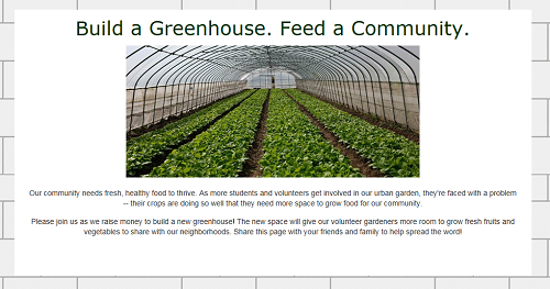
This is arguably the most important part of your form! This is where you’ll make your appeal. Use good images and a short, powerful story to bolster your appeal.
WHAT I DID
Here, I established that my nonprofit’s volunteers were running out of room to grow food for our community. I used a picture that went along with the project, I established how the money would be used, and I asked people to share the page with their family and friends.
WHAT I WOULD IMPROVE
To make this a more powerful ask, I would choose a different image that shows volunteers in a greenhouse or volunteers building a greenhouse. Those are hard images to find in a quick Google search!
I’d also re-write the appeal to be more personal – I’d use more “you” and “your” words, and I’d refer to “families” or “people” instead of just referencing our community.
The Amounts
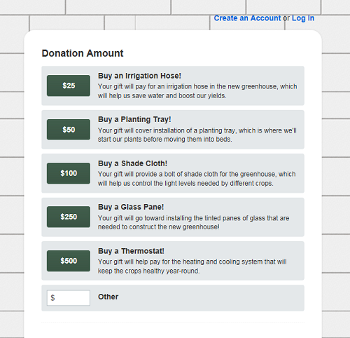
When for-profit companies or inventors use crowdfunding, they often offer incentives based on the level of a person’s gift. You can do something similar! Instead of offering a gift, show donors what their money buys. Donors want to know that their money is actually going toward a tangible goal. Giving them a way to visualize how their money will be used connects them to the work you’re doing and how they can make a real impact on the project.
WHAT I DID
I tried to associate each suggested amount with something tangible. Even the smallest suggested donation amount is associated with something important, so each donor feels like their gift matters.
Note that there’s an option to give a custom amount – that’s important! Don’t force your donors to give only certain amounts; that’s a great way to lose out on a gift.
WHAT I WOULD IMPROVE
I’d probably add a sentence or two about how each donation makes a difference and reference how even custom amounts are important.
The Fields
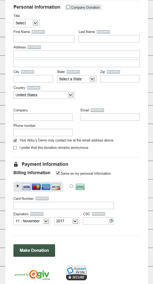
This is part of a donation form is often neglected. But it’s important! Not optimizing the fields donors must complete makes it less likely that they’ll finish their gift.
WHAT I DID
There are a few key points here. The first is that I kept any additional fields – donation dedications, extra questions, etc. – to a minimum. There’s also a check-box for donors who want to use the same billing and personal address, which means they don’t have to enter information twice.
I did include the option to make an anonymous donation and a way for people to opt in to additional emails from my group.
You’ll notice that the security seals at the bottom of the form are right beneath the “Make a Donation” button. This assures donors that their information is secure. This is especially important!
WHAT I WOULD CHANGE
There’s not a lot I would change here. Most of these fields are the bare minimum required to take a donation online.
The Thermometer
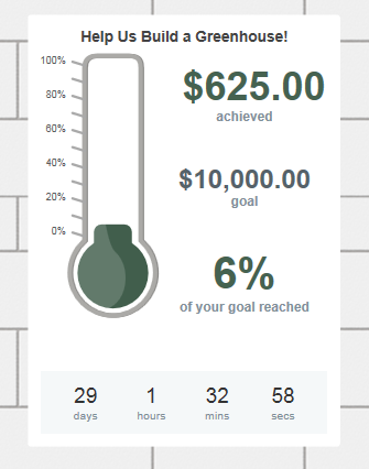
Thermometers are a staple of crowdfunding for nonprofits. They help donors (and nonprofit staff) track progress in an easy-to-digest way. They also show donors that they’re working toward a goal. Humans are hard-wired to want to achieve goals, so it’s a great way to motivate donors.
Part of what makes crowdfunding a good fundraising tool is a sense of urgency. That sense of urgency is what inspires donors to give now instead of putting off making a gift. Including a count-down to the end of the campaign is really helpful!
WHAT I DID
My thermometer is right next to the suggested donation amounts, so the sense of urgency and progress is top-of-mind for people who are making a gift. There’s also a count-down, and donors can see exactly how much people have already given.
WHAT I WOULD CHANGE
I’d replace the line “Help Us Build a Greenhouse!” with something a little more exciting.
The Social Sharing
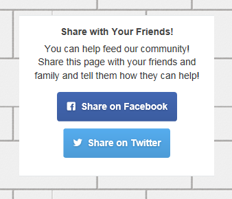
Crowdfunding, especially crowdfunding for nonprofits, depends heavily on social sharing. Making it easy for people to share your page is so important! The more eyes you can get on your page, the more people are likely to support your cause.
WHAT I DID
I included a social sharing widget right under the thermometer. The buttons are accompanied by a short blurb encouraging people to share.
WHAT I WOULD CHANGE
Setting up this widget made me realize something: I don’t know the best practices around this! On the one hand, social sharing can make or break a crowdfunding campaign. On the other hand, many experts suggest removing any calls to action or links on donation forms to avoid distracting donors.
Next time, I’d do some more research. As it is, the three major crowdfunding platforms (IndieGoGo, GoFundMe, and Kickstarter) all include social sharing buttons near the top of the forms just like I did. Although those platforms don’t specialize in crowdfunding for nonprofits, they are the ones who pioneered this style of fundraising. I’ll follow their example!
The Side Content
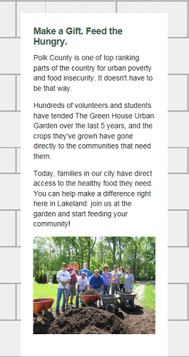
Every nonprofit has a story to tell. Including a small area on your page on to talk a little about why your mission is important is a go-to tactic for many nonprofits.
WHAT I DID
I included a small blurb about why my nonprofit’s mission was important. I also encouraged people to join us as we grew food to give to families who needed it.
WHAT I WOULD CHANGE
The side content was actually what I debated most. On one hand, I don’t want donors to get distracted from the donation process by reading about our mission. On the other hand, I want to inspire them to get (and stay!) involved.
Next time, I’d do some testing to see if including a blurb about our mission distracted donors, inspired donors, or didn’t make a difference.
This is Just the Beginning
Your crowdfunding form is only part of your campaign. In our next entry, we’ll look at how to make the most of thank-you pages and receipts.
Like What You See?
This crowdfunding form was built on Qgiv’s fundraising platform. I used our content management system to put it together, and it took me 10-20 minutes (closer to 10 if you don’t count the random Google searches I threw in there). I’ve never put together a crowdfunding form before, and I don’t have any design experience, so you can do it, too!
If you’re a Qgiv client, putting together a crowdfunding campaign is easy. Our progress thermometers and Form Builder will help you put together a page in just a few minutes. If you want some help building out your form, you can call us at 888-855-9595 or email support@qgiv.com. We can help you!
If you’re not a Qgiv client, it’s really easy to get started using our platform. Our tools are all built especially for nonprofits, and we have a fantastic support team who can help you get set up and fundraising quickly.
