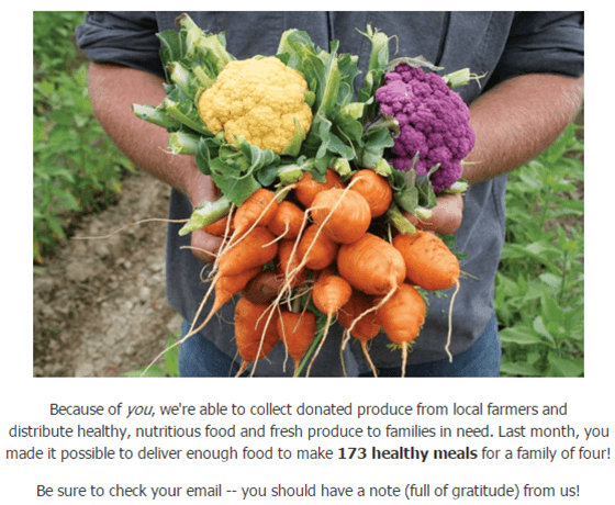
Think about it — you’ve done all the work of emotionally priming a visitor to your website through the use of storytelling, a gift has been made, and your donor lands on your thank-you page.
What do you want the donor to see?
Not a barren, cold transaction receipt! Here are some ways you can maintain that warm-and-fuzzy feeling in donors by customizing your thank-you page.
1. Tell donors about the impact the donation they completed only seconds ago will make. Include pictures to show them!

2. Preview future communication – will donors receive an email, a thank-you card in their mailbox, and/or a telephone call?
3. Thank the donor! It is a thank-you page, after all, so use your manners.
4. Don’t leave your donors wondering if the donation was actually processed – provide verification!
5. Give them something to do next by providing options for social sharing.
6. Give information about gifts being tax-deductible. It might be boring, but donors don’t want to search for this. If you don’t include it here, be sure you put it in your email receipt.
If you’re a current Qgiv client, you can use Form Builder to achieve everything we’ve discussed here! You’ll also find additional options for changing the color scheme and font, and there’s even a place for Custom CSS.


