Last year, 35 million people participated in Giving Tuesday and over 2.7 billion dollars were raised for nonprofits in the United States alone. The social media-driven holiday resulted in billions of social impressions last year alone. These stats are impressive and represent the viral nature of Giving Tuesday. If your nonprofit plans on participating in Giving Tuesday, you’ll need a social media strategy that captures the event’s online momentum and prevents your messages from getting lost in the shuffle. That’s where branding comes in.
Why branding?
Determining the visuals and messaging you’ll use for Giving Tuesday ahead of time ensures that your marketing and development teams have a clear framework to build appeals, graphics, and more. This design and messaging framework makes up your Giving Tuesday campaign brand.
Branding done well can add legitimacy to your Giving Tuesday campaign, increase engagement on your posts, and even result in more donations to your nonprofit. To create a clearly branded Giving Tuesday campaign, there are a few things you should consider:
Messaging: Your value proposition
Before you begin publishing social media “Save the Date!” posts, determine what your Giving Tuesday messaging and asks will be centered around.
Pro tip: giving on its own is not enough. Thousands of organizations will be asking for donations on Giving Tuesday. Therefore, if you want your Giving Tuesday posts to be compelling, you need your messaging to focus not only on giving, but on why people should give to your nonprofit.
An easy way to identify the “why” for your nonprofit is to create a Giving Tuesday value proposition. Your value proposition is a short outline about what differentiates your nonprofit from others asking for donations on December 3rd. According to Peter Smudde in Managing Public Relations, your value proposition can be outlined as a simple two-part statement:
- Theme/slogan: The one super important thing that makes your nonprofit unique.
- Proof points: A handful of statements that directly support and provide evidence for the theme or slogan.
For instance, if your slogan is “24 hours to make a difference,” weave your proof points into your posts throughout the day. Describe how donations made during the 24 hours of Giving Tuesday can make a difference for those your nonprofit helps.
Hashtags
Don’t forget to include the #GivingTuesday hashtag in your posts! Using the hashtag helps increase the visibility of your posts and increases the odds people who don’t follow your organization on social media discover your campaign.
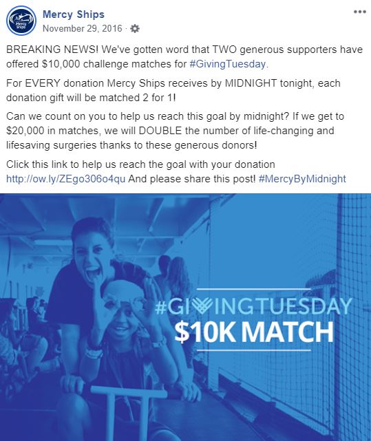
In addition to using the Giving Tuesday hashtag, consider creating your own hashtag for the day that can be used to brand your campaign. A unique hashtag gives your supporters a way to connect their Giving Tuesday posts to your campaign specifically.
For example, check out this unique hashtag created by Mercy Ships for Giving Tuesday below!
Logos
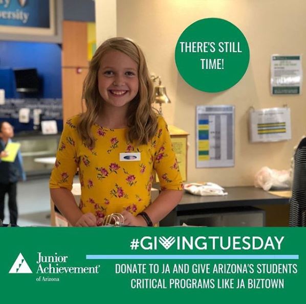
Giving Tuesday already has clear branding and a recognizable logo. So, for your Giving Tuesday posts, incorporate the official Giving Tuesday logos (download them here). Other nonprofits use these logos heavily during Giving Tuesday, so find ways to individualize the logos and tie them to your nonprofit. Giving Tuesday’s transparent logos make this easy! Place these logos over your nonprofit’s own photos for a branded look that aligns with your nonprofit.
Be careful to keep your usage of the Giving Tuesday logos to a minimum—just because there are ten different logos doesn’t mean you should use them all! You want your posts to be recognizable to your supporters.
For example, see how Junior Achievement of Arizona used the Giving Tuesday logo below while keeping their unique look.
Visuals
Visual content receives more than two times more engagement than basic text or link posts. Facebook and Instagram’s algorithms prefer featuring posts that have engagement activity. Therefore, the more likes, shares, and comments on your posts, the more visible they are. For your posts to be seen your nonprofit must create engaging, visual, content for followers to interact with.
Collect high quality, emotional images from your events, clients, donors, or workplace. Use them to compel supporters to give to your nonprofit. To ensure your images are the right size for each social media platform, use our sizing cheat sheet. Throughout Giving Tuesday make sure your posts have visual consistency. Utilize a color scheme featured in your nonprofit’s logo or website and add those colors to your posts
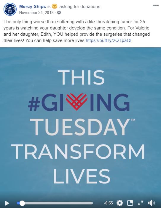
Video is the highest performing type of visual content when it comes to engagement. If your nonprofit has the time and resources to create videos, do it! Watch the video created by Mercy Ships below for an example of what a great Giving Tuesday video looks like.
Next up in The Giving Tuesday Social Media Playbook
Once you’ve established a brand for your Giving Tuesday campaign, you’ll be ready to begin drafting posts for the event. In the next blog, I’ll cover creating your Giving Tuesday “day-of” content. Stay tuned!
Up Next in The Giving Tuesday Media Playbook
Previously in The Giving Tuesday Social Media Playbook
Looking for more Giving Tuesday goodness? We’ve got you covered with the Giving Tuesday Resource Center!


