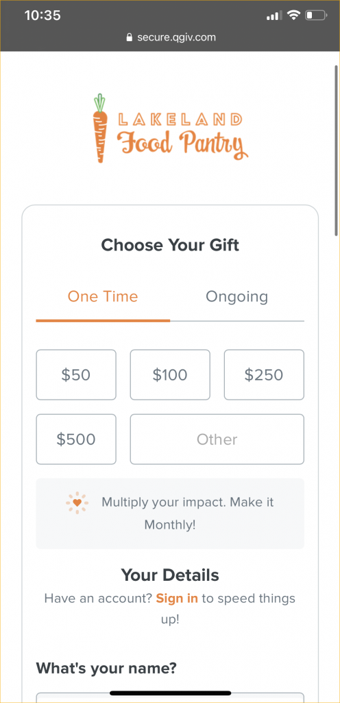
Squinting, pinching, zooming in and out–how frustrating is that?! When all you want to do is make a quick purchase, nothing dissuades you from completing your transaction quite like a frustrating website. The same goes for donors trying to make a gift on a donation form that isn’t mobile friendly. A mobile-friendly donation page makes the giving experience better for visitors on smartphones, tablets, and computers.
Do you still need convincing? Not sure how to optimize your website for mobile giving? Read on for the top three reasons to make your donation form mobile and how to ensure your website is ready for all devices and visitors.
Why make a mobile-friendly donation page?
There are three important reasons to get your website mobile friendly:
- On average, more than 50% of web traffic comes from mobile devices (we see you over there on your phone!)
- Mobile-friendly sites boost SEO optimization and increase reach
- Mobile users are more likely to make and complete a purchase (but only if your site makes it easy)
In addition to these three factors, a mobile-optimized website looks more modern and delivers a better user experience.
Capture more mobile traffic
According to Statista, mobile devices accounted for an impressive 50.8% of global website traffic in 2020. What’s more impressive? That number doesn’t even include traffic from tablets! If your website isn’t optimized for mobile traffic, you’re likely not capturing as much web traffic as possible. As mobile devices grow in popularity and account for greater amounts of web traffic, sites that don’t adapt will see significantly fewer visitors. For nonprofits, this can also mean significantly fewer online donations.
Imagine if a shopper loaded up their cart at a physical store but left without completing their purchase 50% of the time. That’s what happens when donors abandon the online donation process because the form is too difficult to complete.
You can easily avoid losing traffic and donations by creating mobile-responsive websites and donation forms. Luckily, Qgiv’s donation forms are mobile friendly by design. You just need to make sure your website matches the responsiveness of your donation form.

Attract new traffic with higher SEO ranking
When people search for your website, your hope is that your webpage comes up right away. If your website isn’t mobile responsive, you’re probably not ranking very well on Google. That means people looking for your nonprofit may not be able to find you. What’s worse is they may find your competition first!
Why is a mobile-friendly website so important for your search results? According to CEO Magazine, “almost 60% of Google searches are made on mobile phones.” Google recognizes the importance of providing results that function well on mobile devices, so they penalize websites that aren’t optimized for mobile devices. Your website and donation form need to be mobile friendly to avoid getting buried by other websites that are optimized for mobile devices. When you develop a mobile-friendly website, you’ll be rewarded with increased visibility for having a website that looks good on any device!
Boost online donations by catering to mobile donors
According to a survey conducted in 2019 by Marketing Dive, smartphones are the most popular device for online shopping. 81% of consumers surveyed bought gifts using smartphones, and 45% of surveyed consumers reported using smartphones to shop regularly.
By contrast, a survey by AdColony reported that only 28% of respondents plan to shop using a computer. Donations made online are like online purchases. Donors go to your website, conduct research, and complete a transaction if they like what they see. That’s why a mobile-friendly donation page is so important! If the online shopping experience is bad on a mobile device, many consumers will find a site that works better rather than dusting off their laptop. Your donors will do the same thing if your donation form doesn’t work on their mobile device.
Just like boosting your SEO ranking by having a mobile-friendly website, you can also boost donations by catering to donors who give using their smartphones. Crafting a great user experience for users across all devices acts as a welcoming invitation to make a gift. A donation form that’s easy to use can greatly boost online donations.
How to make your website mobile friendly
There are a few things you can do to assess how mobile friendly your website is. Once you know what needs to change, you can update the functionality of your form so that it’s responsive for all devices. A great place to start is by following these nonprofit donation page best practices.
Focus on speed
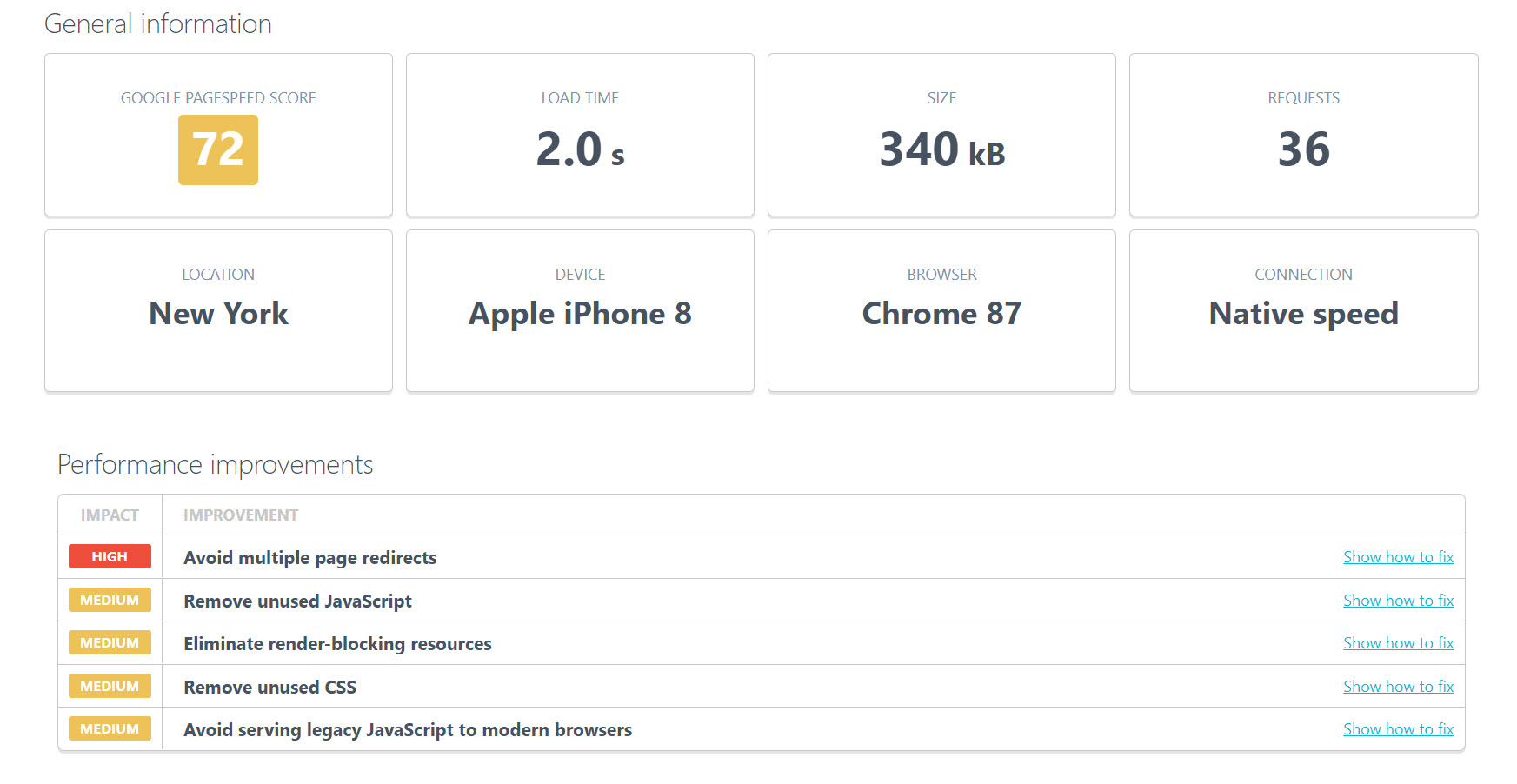
An element that’s crucial for a mobile-friendly website is your site’s speed. Waiting on a page to load can turn visitors off from your site. Mobile-friendly sites should be simple and fast.
Speed matters–especially on mobile, which can be dependent on the strength of a phone’s signal. Luckily, you can test the speed of your website for free! Uptrends offers a free website speed test that also shows how speed can be improved. This speed test for Facebook shows several ways speed can be increased.

It’s hard to pass a speed test with flying colors if your website includes more than just text. The faster your page loads the better. Don’t bog down your page with unused elements or huge image files that can slow download speeds. Afraid your images are too large to load quickly? Use services like Kraken.io to decrease the file size of your image without sacrificing size and quality.
Make responsiveness a priority
Aside from speed, the next major element to focus on for a mobile-friendly website is responsiveness. Responsiveness is your website’s ability to adapt its display to a variety of screen sizes while maintaining a great look and easy user interface.
Before the ability to make a website mobile responsive existed, many organizations made a separate mobile-friendly site sized for smartphones. Unfortunately, this solution isn’t cost effective and requires maintaining two different websites. With a mobile-responsive site, users can make changes on one site that are reflected across any device used to access it. With a responsive site, users no longer need to pay for and maintain two sites based on mobile and desktop traffic. For a more in-depth explanation of mobile-responsiveness and its importance, check out this blog post from WebFX, a Pennsylvania-based marketing firm that focuses on digital marketing.
Use Google’s mobile-friendly test
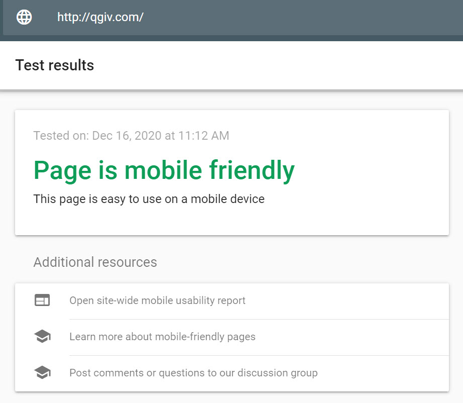
Google values mobile-friendly websites over websites that haven’t been optimized. To help web designers assess how mobile friendly their websites are, Google developed a simple mobile-friendly test. Testers enter the website’s URL, and Google analyzes the site for overall mobile friendliness. Web designers can then make changes based on elements that are holding the site back according to Google’s criteria.

Once you’ve edited your website for speed and mobile-responsiveness, make sure those changes pass the mobile-friendliness test. Your results should show that your page is mobile friendly. If it isn’t, open the site-wide mobile-usability report for in-depth analysis of what needs to be improved.
Simplify your website
Once your website has been made responsive, the next step is simplifying your navigation and appearance. A simple donation form makes it easy to make more money by creating a better user experience. To create a better user experience for mobile users, make it easy for them to find the information they’re looking for on your website. Make big, clickable buttons and use large fonts that render well on mobile. Simplicity tends to make for a much better user experience on smartphones. The fewer taps it takes to find the information users want, the better.
The Pittsburgh Glass Center website on mobile phones does a great job of this. They offer glass kits for purchase and created an appealing effect to show users which item they have selected. Users can click the picture to read more details and add items to their cart.

Conclusion
A mobile-friendly donation page paired with an equally optimized webpage can drive more traffic to your website, delight your visitors, and even increase the number of online donations you receive. If your website isn’t already optimized for mobile devices, analyze your site, find out how you can improve, and make those changes. Want more nonprofit website tips? Check out this on-demand webinar from nonprofit website whisperer, Rachel Clemens, to take your mobile-friendly donation page to the next level.


