Your online donation forms have the potential to boost your fundraising results. But how do you know if your donation form is hurting or helping your chances? We’ve put together this list of 5 ways you can optimize your online donation forms to increase the funds you raise. Each of these options has been proven to boost fundraising, but like all things, your mileage may vary. Test out what works and doesn’t work for your nonprofit to make the most of these revenue-boosting tips.
- Include impact images
- Incorporate a recurring giving nudge or modal
- Add a matching gifts integration
- Make your call to action clear
- Simplify your donation form
1. Include impact images

The very first step to optimizing your online donation forms is to use impact images to show donors the good that they can accomplish when they donate to your nonprofit organization. You can incorporate images in many ways. Just make sure that you’ve optimized your images for online use so they don’t bog down your donation form and make it slow to load.
One way to incorporate images is to attach each image to a corresponding giving level to show exactly what’s being accomplished at each level. This shows donors what their gifts will accomplish, especially if you pair it with an impact statement that corresponds with the image.
Another option is to use one image on your online donation form that corresponds with a specific need that you need to address. This rallies everyone behind a single need when they donate on that form. It also makes it clear where donations are going and how they’re going to help. Brother Wolf Animal Rescue did a great job of this with their campaign to rescue a puppy named Hope. The result of using an impact image on their form? They exceeded their fundraising goal by 345%!
2. Incorporate a recurring giving nudge or modal

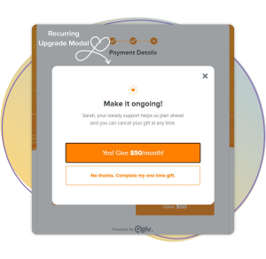
Do you want to grow the number of recurring donors you have at your organization? Most nonprofits would gladly accept more monthly donors to their cause. You can accomplish this task by adding a recurring giving nudge or modal to your online donation forms. This option encourages one-time donors to consider making a recurring gift instead.
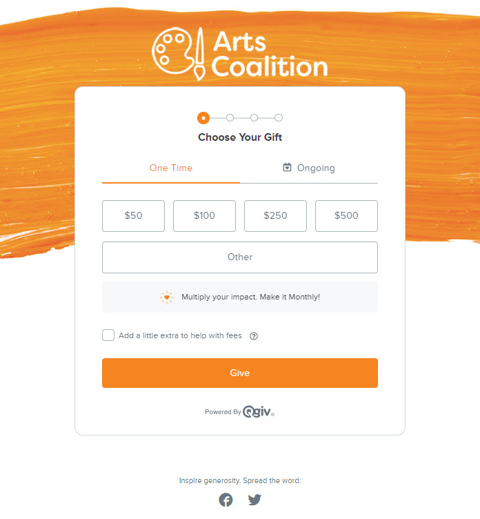
The nudge is a less pushy way to suggest recurring giving to your donors with a one-line statement on your online donation form about how recurring giving can increase their impact by giving on a recurring basis.
To really get donors to take notice and consider a recurring gift, use a recurring modal. This is a pop-up window that appears when donors prepare to make a one-time gift. It asks them to consider giving on a recurring basis instead. You don’t force your donor to give on an ongoing basis with the modal, but it definitely gets their attention and makes them think about making a recurring donation.
You can learn more about the recurring gift nudge and modal here.
3. Add a matching gifts integration

If you want to take your online donation forms to the next level, incorporate a matching gifts integration. It’s a quick and painless way to double the value of a donor’s gift to your nonprofit organization. A donor just needs to search for their employer in the matching gifts search bar. If their employer offers a matching gift program, they’ll be listed in the search results for the donor to select. Then, they just complete their donation as normal. After they give, they’ll automatically receive instructions on how to apply for a matching gift from their employer.
The employer-specific instructions are sent to the donor to complete right after they make their gift and are still experiencing the warm fuzzies from giving. While they’re in that mindset. they’ll be more inclined to complete the matching gift paperwork and have their gift matched by their employer. That doubles the value of their original donation!
4. Make your call to action clear

When it comes to online donation forms, having too many options is a bad thing. You want to provide a streamlined and efficient donation process for would-be donors to avoid donation abandonment. When donors click away from your form, they’re unlikely to return to complete their gift. That’s why optimizing your forms to avoid form abandonment is so important. And one important aspect of that is keeping your call to action clear.
The beauty of Qgiv is that we offer unlimited donation forms to our clients. That means you can create a different form for each of your unique calls to action. This provides a better donation experience for would-be donors than a single donation form with multiple calls to action on it. Multiple calls to action can easily overwhelm a donor, especially if there are multiple funds to choose from. Instead, try to create one form for every fund that your nonprofit raises money for. Pair unique impact images tailored to each funding need for maximum effectiveness.
5. Simplify your donation form

Like your call to action, the rest of your form should be simple and clear. Avoid having a ton of extra fields on your form for donors to complete. Too many forms will lead to donation form abandonment, and as we stated before, that’s a big problem! You don’t want donors to leave your form without completing a gift. That’s why it’s best to keep your form short and simple.
Not only should your form be short, but you should also use simple language on the form that the majority of people will understand. That way, you can cast a wider net for potential supporters when they land on your online donation form.
By keeping your form as short and simple as possible, you streamline the donation process and create online donation forms that are a pleasure to use. This will attract more donations from people telling their friends and family about how great their giving experience was.
Conclusion
With these five steps, you can optimize your online donation forms and earn a greater return on investment. From showing who you help (and why) to making your call to action simple to find and act on, you’re ushering donors through the giving process and making it easy to make a difference.


