Once upon a time, a fundraiser dozed in front of a fire when she was startled awake by a booming voice.
“I AM THE GHOST OF CHRISTMAS FUNDRAISERS PAST,” it said.
Surprised and irritated, she looked up to see a frazzled-looking ghost clutching what looked like several drafts of a fundraising appeal and a cup of coffee.
“I HAVE COME TO SHOW YOU WHAT ONCE WAS CORRECT AND NOW IS WRONG,” it continued. “BUT WE HAVE TO HURRY; I HAVE TO HAVE THIS TO PRINT IN LIKE THREE HOURS.”
“Are you sure we have to do this now?” she asked. “It’s the busiest time of year. I need a nap.”
“I DON’T MAKE THE RULES, LADY,” the ghost said. “THE BOARD DOES. LET’S JUST GET THIS OVER WITH.”
The fundraiser rolled her eyes. “Fine,” she said. “Whatever, just hurry up.”
The First Ghost: One-Page Donation Forms
“WHOOSH!” said the ghost. The fundraiser saw herself sitting in her office building a donation form for the 2018 Christmas campaign.
“Did you actually just say ‘Whoosh!’?” she asked.
“DON’T ASK QUESTIONS,” said the ghost. “BEHOLD! THE FIRST OF THREE OUTDATED BEST PRACTICES—THE ONE-PAGE DONATION FORM.”
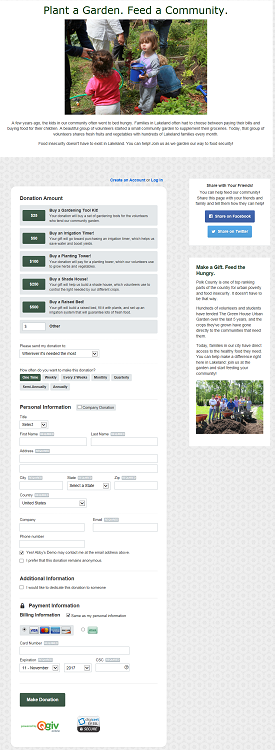
You see, the one-page donation form used to be best practice, but it’s no longer exclusively the most effective way to accept donations online! Before, the idea was to let donors complete their donation all at once without clicking through different screens that collected different pieces of information. Donation amount, personal information, billing information, and other fields were all displayed on one form.

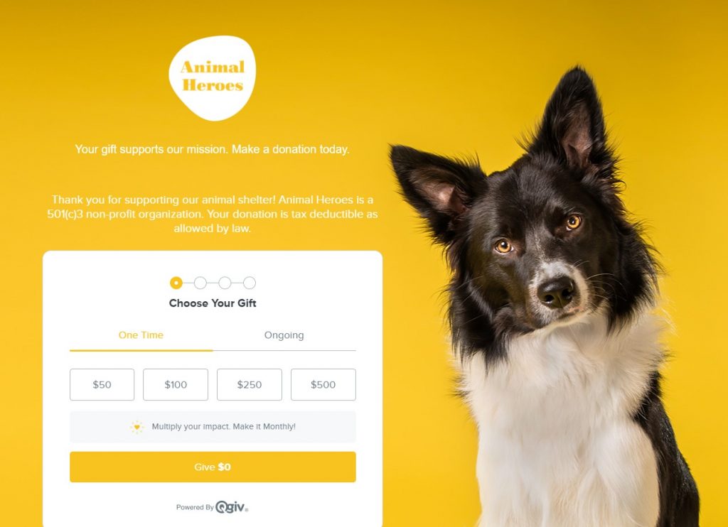
But donor preferences and behaviors evolve and so must we! Now, donation forms that are split across multiple steps often outperform forms that are all on one page.
There are a few reasons for this, but the most important one is that moving donors from step to step helps them solidify their decision to give. When someone indicates a gift amount and is taken to a new screen to finish their transaction, their decision to give has been finalized. The subsequent steps of providing their information are just a formality. On a one-page donation form, there is no sense of closure or finality after a donor has chosen to give. Because it’s all on one page, the decision to give feels more open-ended, and donors are more likely to navigate away from the page before completing their donation.

“SEE?” boomed the ghost. “SPLIT UP YOUR DONATION FORM.” It shuffled through its papers and made a show of checking something off. “OKAY. ON TO THE NEXT ONE.”
The Second Ghost: Tax–Deductibility Language on Donation Forms
“WHOOSH!” said the ghost again.
The fundraiser snorted.
“We didn’t even move,” she said. “We’re literally standing exactly where we were a minute ago.”
“YOU TRY PLANNING THESE TRANSITIONS WITH MY BUDGET,” boomed the ghost. “PAY ATTENTION. THE SECOND GHOST—TAX-DEDUCTIBILITY LANGUAGE ON YOUR DONATION FORMS.”
The fundraiser squinted. Her past self had just pasted a few lines of text into the content at the top of her donation form. “This organization is a 501(c)(3) with tax-exempt status. Your donation is 100% tax deductible,” it said.

Adding a note about donation’s tax deductibility used to be common. But, as we learn more about donors’ motivations, the more we realize that highlighting a nonprofit’s IRS status doesn’t necessarily boost conversion rates.
When we surveyed 1,300 nonprofit donors for our Generational Giving Report, we asked them how motivated they were by tax deductions. Only 4.6% said it was “a big motivator,” but 51.6% said it wasn’t a motivator at all. Instead, donors were motivated by impact statements that told them exactly how their gift would make a difference. If you want to boost conversion rates on your donation forms, focus your energy on showing donors how their money will be used.

If you want to include information about tax deductions, try including a (very short) bit of copy at the end of your form near the submission button, or even below your form. You can always include it in your website footer or in your email receipts! It’s also easy to send donors a summary of their transactions for the year, so those who want to file itemized deductions can do so easily.
“OKAY, TAX DEDUCTIONS. CHECK,” said the ghost. “ONE MORE STOP.”
The Third Ghost: Businesslike Receipts
“WHOOSH!” said the ghost. “HARK! THE FINAL SPECTER OF BEST PRACTICES PAST—THE BUSINESSY RECEIPT!”
“Who even says hark anymo-” began the fundraiser.
“SILENCE,” interrupted the ghost. “PAY ATTENTION. WE’RE BEHIND SCHEDULE.”
The ghost stretched its finger toward past-fundraiser’s screen. On it was a draft of a receipt.
“On behalf of the CEO and our Board of Directors, thank you for your donation of %AMOUNT%. At our nonprofit, our mission is to serve our community efficiently. Below, please find the details of your transaction. Maintain this email for your records.”
“Seriously? Could you not be bothered to come up with a decent-sounding example mission statement for this?” asked the fundraiser.
“I HAVE TO DO THIS PRESENTATION A LOT,” replied the ghost. “WRITING EXAMPLE COPY THAT WORKS FOR LOTS OF DIFFERENT KINDS OF NONPROFITS IS HARD. KEEP READING.”
Vague mission statement aside, this formal-sounding receipt falls far short of current best practices that emphasize good donor experiences. Yes, a donation to your nonprofit is technically a financial transaction. But it’s more than that! It’s an investment in an important cause from an individual (or business) that connected with your mission on an emotional level. Referencing that emotional connection is an absolutely critical part of a good donation receipt.

Your receipts should absolutely contain the donor’s gift information. But it should also contain an impact statement about what their money will achieve, a note about how thankful you are for their support, and an overall air of heartfelt gratitude. Leave the formal receipts to the banks and utility companies; to make a good impression on your donors, create receipts that are genuine and celebratory, not cold and transactional.
Conclusion
“WHOOSH!” cried the ghost a final time, and the fundraiser found herself back in front of the fireplace. “I’M SUPPOSED TO CONCLUDE MY PRESENTATION WITH A SUMMARY OF WHAT YOU’VE LEARNED,” said the ghost, and handed the fundraiser a list. On the paper, it said:
- Split up your donation forms instead of having all your fields on one long form
- Replace tax deductibility language with donor-friendly impact statements
- Create a warm, friendly donation receipt instead of a formal-sounding transaction receipt
“Okay, this is all great,” said the fundraiser, “But what do I need to do to make all of this happen?”
“I’M GLAD YOU ASKED,” said the ghost. “I AM ALSO SUPPOSED TO GIVE YOU THIS BUTTON THAT WILL PUT YOU IN CONTACT WITH A TEAM OF PEOPLE WHO CAN HELP YOU GET THE TOOLS YOU NEED TO UPDATE YOUR PROCESSES. HERE—”


