Between managing volunteers, bringing in donations, planning upcoming events, and more, carving out the time to craft a social media strategy can feel impossible. For a busy nonprofit, it’s easier to see examples of what works rather than read a laundry list of what you should and shouldn’t be doing. Here at Qgiv we understand the craziness of a nonprofit schedule. So, we rounded up some clear examples of nonprofits that successfully use social media to build support for their cause. Following these examples will help increase engagement and donor confidence in your nonprofit—and that’s always a win in our book.
Branding: make your nonprofit’s message stand out
“Branding” is more than just a buzzword. Done well, branding can increase your nonprofit’s perceived legitimacy online and make your content more recognizable. Why does your content need to be recognizable and stand out? Facebook users share 684,478 pieces of content per minute. Each day more than 500 million tweets are processed on X and 80 million photos are posted to Instagram. When your supporters scroll through their feed, do they immediately connect the event photos you just posted with your organization? This connection is critical because it helps a range of supporters identify your organization. There’s no point posting about the impact a donation can have if your followers don’t connect their potential impact with your organization.
To incorporate branding into your nonprofit’s social media strategy you should utilize a consistent color scheme, logo, and (depending on the resources at your disposal) a set of icons. What you’re trying to create with this consistency is a recognizable look. Branding ties everything you post back to your organization in a visual way.

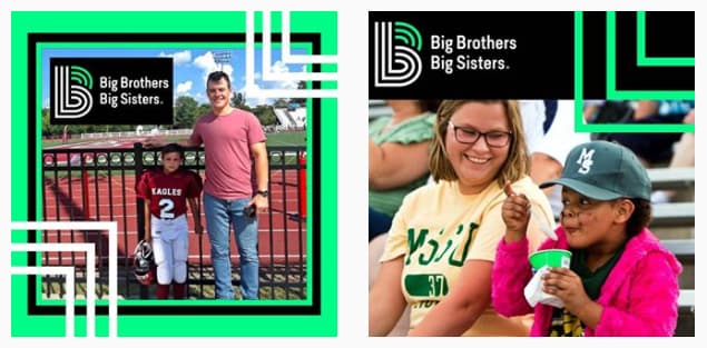
Big Brothers Big Sisters of America (we’ve provided examples from Big Brothers Big Sisters of Jasper and Newton Counties) has a clear brand—green and black principle colors, a logo that uses these colors, and square lines/shapes. Try to follow their example for the visual content you post and be sure to ask yourself: will my supporters tie this image to my nonprofit?
Short and sweet: keep your copy short and your visuals intriguing
You want your organization’s posts to be seen—why else would you be using social media? For your posts to be seen, ensure that your content is something your followers will want to engage with. Facebook and Instagram’s algorithm prefers featuring posts that have been engaged with. The more likes, shares, and comments on your posts, the more likely they are to be seen.
So what’s the recipe for engaging content? Images and short copy. Posts with images get 2.3 times more engagement, and on Facebook alone, posts with photos receive 37% more engagement than those without. Your posts need engagement to beat the algorithms used by Facebook and Instagram. High engagement increases the visibility of your posts.
Once you’ve added a photo to your post to make it visually interesting for your followers (resulting in higher engagement), it’s time to focus on your post copy. Your goal should always be a clear and concise message that maintains your nonprofit’s voice. Your followers see hundreds of posts a day and aren’t very likely to stop and read a paragraph when everything else competing for their attention is only a few sentences long. Shorter posts experience higher engagement rates—so make your words count!
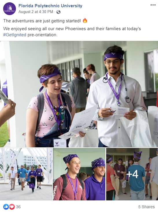
Florida Polytechnic University gets it. They keep their copy short and always incorporate interesting images in their posts.

Graphics: a powerful tool to inspire and educate your audience
How often do you educate your followers on the importance of your mission and work? Your nonprofit exists to meet a need. Social media is a great platform to teach potentially thousands of individuals why your work is important and worth supporting.
Considering the importance of visual and engaging posts, graphics are an excellent way to inform your followers why your nonprofit’s work is critically important. Use sites like Canva and PicMonkey to create graphics with a statistic or quote–with little to no design experience.
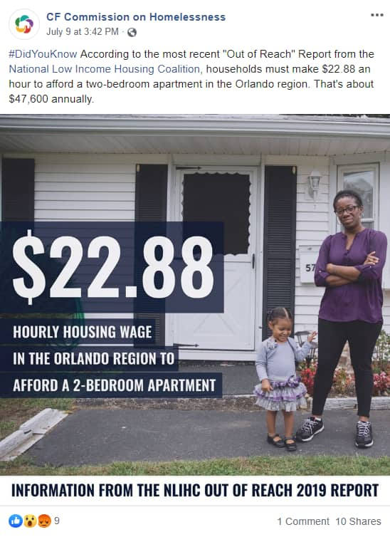
This graphic, created by the Central Florida Commission on Homelessness, is eye-catching and clearly illustrates how basic housing can be costly and out of reach.

Final thoughts
Social media is an excellent tool for your nonprofit to share its mission and communicate with supporters. Increase the visibility and engagement on your posts; focus on posting visual content that is recognizable to your audience, eye-catching, and concise.
Not sure where to begin? Check out this blog, “Amp Up Your Marketing By Replacing Stock Photos With Your Own“.


