This guest post was contributed by Christine Soucy at Wired Impact.
You’re kicking off a fundraising campaign, but will your website visitors know about it? Updating your content based on a few simple website fundraising ideas can help keep your site up-to-date for each campaign you run.
Your nonprofit’s priorities shift on a regular basis, and your website content and calls to action should shift along with them. Otherwise, your website will fail to move visitors toward the things that you care about most at that point in time—whether it’s donations, memberships, event attendance, or another key action.
Website Fundraising Ideas
There are a wide range of ways that you can use your website to alert visitors about new fundraising campaigns. Keep this list handy and run through it each time you launch a new fundraising effort.
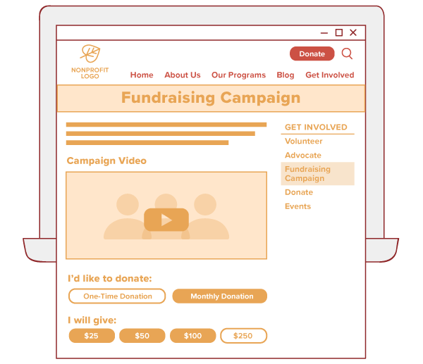
Create a landing page
Set up a dedicated page on your website for your fundraising campaign and direct visitors to that page from around your website. For all of the following calls to action (CTA, for short) around your website, link visitors to this strong landing page for the campaign.
This page should anchor all of your promotional efforts and include all your campaign’s details, including dates, where the funds are going, the driving purpose of the campaign, any matching gifts opportunities, and a donation form.
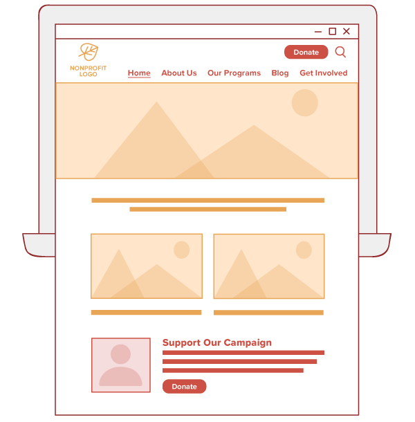
Homepage call to action
Your homepage is probably the most visited page on your website. Include a call to action within your homepage content to let all these visitors know about your new fundraising campaign and call them to participate.
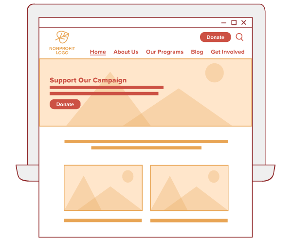
Homepage hero image
Your homepage hero image is eye-catching and in-your-face as soon as a visitor lands on the page. For important fundraising campaigns, make the most of that space to draw supporters’ attention to the campaign with a strong image. Be sure to keep text within the image to a minimum and include a strong call to action.
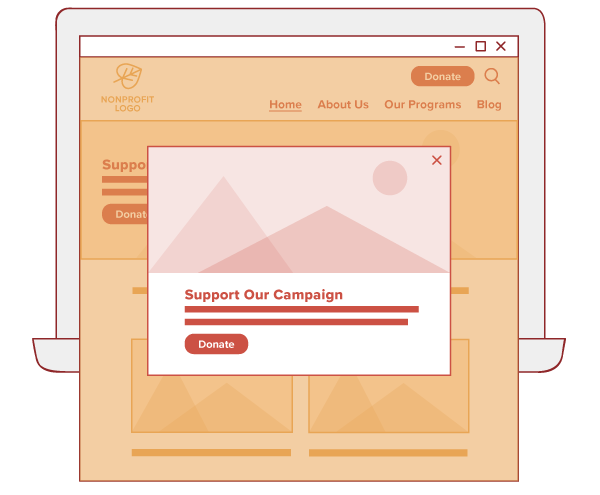
Popup on your website
Website visitors are used to pop-ups, and (when done right) we’ve seen them work wonders for nonprofits. Create a pop-up promoting your fundraising campaign that shows on key pages of your website, like mission-based content and your homepage.
Sidebar call to action
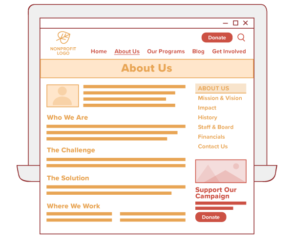
You know that section to the right of page that often includes navigation items and key calls to action? That’s the sidebar, and it’s a great place to promote your campaign. If possible, create a sidebar call to action for your campaign. Then, add it to those pages on your site where it makes the most sense, like your Mission & Vision, Impact, or Get Involved pages.
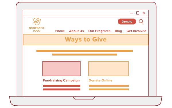
Call to Action on your Ways to Give page
Your fundraising campaigns are definitely ways to give, right? Add a call to action to the content on your Ways to Give page to let supporters know about this new way to support your mission.
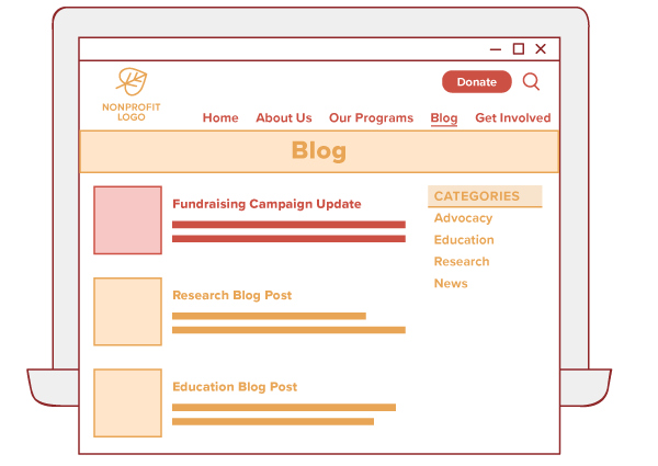
Blog post updates
Use your blog to keep your supporters updated on your campaign’s progress. Publish a few blog posts throughout your campaign to let supporters know how it’s going, share what you still need, highlight star supporters, or report impact from the campaign thus far. You can even link to these updates in campaign fundraising emails!
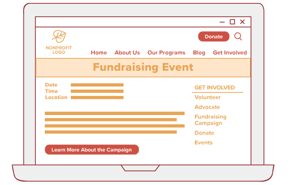
Within fundraising event pages
Lots of nonprofits use events as part of an overall fundraising campaign. Make sure you link your fundraising campaign page on relevant event pages.
Popular pages on your site
Use your popularity to let all of your visitors know about your fundraising campaigns. Review your website analytics in search of high-trafficked pages. And, within the content of those pages, look for opportunities to link your fundraising campaign. You might even use an inline CTA or include a brief CTA that looks different from the rest of the page.
Content Tips for Campaign Promotion
Now that you have a few ideas on where to promote campaigns on your website, I wanted to touch on a few of the hows.
Fundraising campaign content should use:
- Strong calls to action — Use urgent, actionable, and specific language. Offer clear direction for what you’d like visitors to do.
- Compelling visuals where possible — Ever hear the phrase “a photo is worth a thousand words”? A great photo that demonstrates your organization’s impact can help move supporters to action.
- Take care with copy — Please no cookie-cutter copy here. Write up original and interesting copy for each fundraising campaign you run.
- Use your nonprofit’s voice and branding — All content and images should adhere to your branding and use a familiar writing voice that your supporters know and love.
While many organizations have fallen into a rut of creating a campaign page, maybe updating the homepage, and then moving on with their lives, you can (and should!) call supporters to act in other ways.
Your nonprofit website has the power to drive people to act, but you need to tell them how. Using CTAs in strategic locations throughout your website can boost your next fundraising campaign and all of your campaigns thereafter.
Where does your nonprofit promote fundraising campaigns on your website? Have any website fundraising ideas to add to our list? Let us know in the comments.
About the Author
Christine Soucy is a content strategist and writer at Wired Impact, which offers websites for growing nonprofits. She works with a variety of organizations to help them get the most out of their digital marketing, from creating content to thinking through marketing plans and diving into data.


